The Anti-Metric Debug Session: Fixing Incidents by Reading Rows, Not Charts

Metrics tell you that something is wrong. Rows tell you what actually happened.
Most incident runbooks start on dashboards:
- Error rate spikes.
- Latency p95 jumps.
- Conversion drops 3%.
You pivot, slice, and annotate charts until everyone agrees: yes, it’s bad. But the moment you ask a concrete question — “What happened to this specific user, on this specific request?” — the chart runs out of story.
The anti-metric debug session is what comes next: closing the chart, opening a calm database browser like Simpl, and reading the rows themselves.
Not because metrics are useless. Because they are too zoomed out to fix most incidents on their own.
This post is about treating row-level reads as a first-class incident tool. A way to move from:
- "The graph moved" → to → "This user hit this edge case at this time."
- "We see a spike" → to → "These ten rows changed in a way they never did before."
If you’ve read about running incidents from a single, focused tool in The Anti-Tab Debug Session, this is the same posture applied to data: fewer panels, fewer charts, more truth.
Why charts are great for alarms and bad for answers
Charts are optimized for:
- Detection – “Something changed.”
- Communication – “Look, this line went up.”
- Monitoring trends – “We’re drifting over time.”
They are not optimized for:
- Reconstructing a single user journey.
- Understanding a weird edge case.
- Debugging a handful of broken rows.
When you stay in metrics too long during an incident, a few things happen:
-
You debug the graph, not the system. You tweak time windows, group-bys, and filters, hoping the right shape will reveal the answer.
-
You overfit on aggregates. Averages hide outliers. Percentiles hide concrete stories. A p95 spike might be 30 users stuck in a specific flow — you need their rows, not a prettier p95.
-
You burn cognitive load on the tool. Every new panel, filter, and dashboard is another decision. As argued in Focus-First Database Tooling, the limiting factor is attention, not feature count.
A calmer pattern: use metrics to find the window of interest, then switch deliberately into a row-reading session.
That switch is the anti-metric debug session.
The core idea: incidents are solved at row-level
Most meaningful production incidents eventually reduce to a small number of concrete facts:
- This user’s subscription was canceled because this job ran twice.
- These payments were double-charged because this flag flipped at the wrong time.
- These emails never sent because this batch job silently skipped rows with a certain state.
Each of those is a row story:
- A specific
id. - A specific
created_atorupdated_at. - A specific combination of columns that “should never happen.”
Charts can’t show you that. At best, they tell you where to look.
The anti-metric debug session is a commitment:
Once we know when and roughly where the problem is, we stop tuning graphs and start reading rows.
That commitment has a few practical benefits:
- Faster root cause. You’re closer to the actual invariants being broken.
- Clearer communication. You can say “Row X changed from A → B at 12:03 UTC” instead of “The red line went up.”
- Better postmortems. Row-level narratives make for precise timelines and concrete fixes.
It also aligns with a calmer, safer way to touch production data: read-only, focused, and traceable. If you’ve explored the idea of the Calm Read-Only Contract, the anti-metric debug session is one of the best places to practice it.
A simple pattern: from alert to rows in four moves
Here’s a concrete flow you can adopt as a default.
1. Use metrics only to frame the incident
Stay in charts just long enough to answer:
- When did this start?
- Which surface is affected? (endpoint, feature, country, plan, etc.)
- How big is the blast radius? (number of users, orders, payments, etc.)
Once you have:
- A time window (e.g.,
2026-06-09 02:00–02:15 UTC) - A rough scope (e.g.,
billingservice,checkoutflow,premiumplan)
…treat the dashboard as “complete enough” and move on.
Resist the urge to create one more slice.
2. Pick a single, representative example
Incidents become tractable when they become personal:
- One user who was double-charged.
- One order that got stuck.
- One request that 500’d.
Find or construct a single canonical example:
- A
user_id,account_id, ororder_id. - The exact timestamp of the problematic event.
- Any correlated IDs (e.g.,
payment_intent_id,job_id).
This is the anchor for your entire debug session.
3. Open a calm row reader, not another dashboard
At this point, you want:
- A read-only view of production (or a faithful replica).
- A single query surface where you can move between a few key tables.
- Minimal chrome, minimal modes, minimal risk.
This is exactly where a tool like Simpl shines:
- Opinionated, read-only by design.
- Focused on exploring and understanding rows, not building dashboards.
- Calm schema surface instead of a giant ERD.
You’re not trying to do ad-hoc analytics. You’re trying to answer: What happened to this specific example? A simple browser, tuned for reading rows, is enough.
4. Tell the story as a sequence of row changes
From here, your job is to reconstruct a narrative using rows:
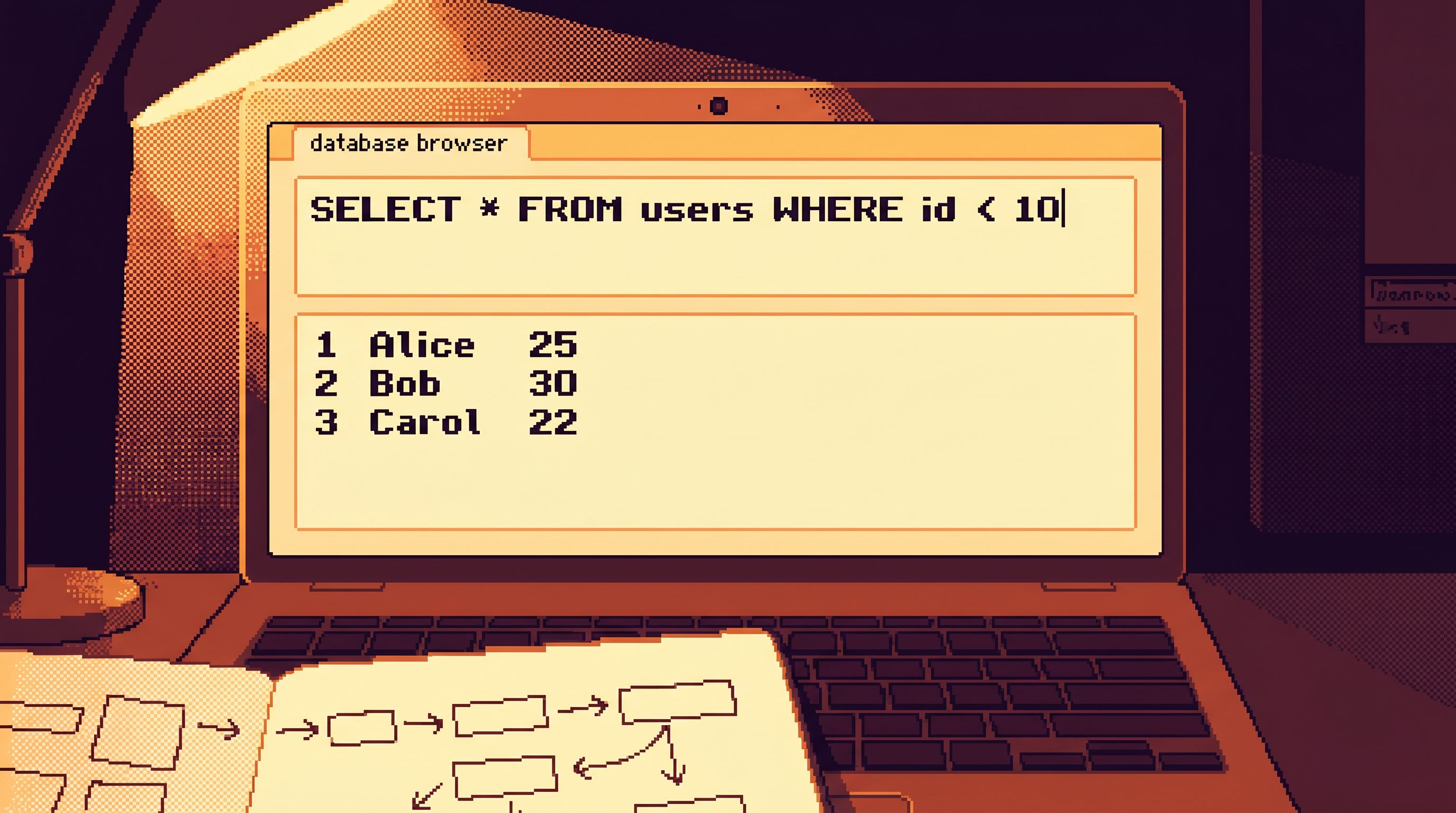
-
Start at the primary entity.
SELECT * FROM users WHERE id = :user_id;- Or
SELECT * FROM orders WHERE id = :order_id;
-
Follow timestamps.
- Look at
created_at,updated_at,statustransitions. - Compare them to the incident window you got from metrics.
- Look at
-
Follow references.
- Join or pivot to related tables:
payments,jobs,events,audit_logs. - Use foreign keys or well-known reference columns.
- Join or pivot to related tables:
-
Check for invariants.
- “This status should never be combined with that flag.”
- “This job should never run twice for the same entity.”
- “This timestamp should always be after that timestamp.”
-
Write down the row-level story.
- At
T1, the user signed up. - At
T2, the subscription was created. - At
T3, the background job retried with stale state. - At
T4, the subscription was canceled unexpectedly.
- At
Once you can tell this story in plain language, you’re ready to propose a fix.
What a good anti-metric debug session looks like
A strong session has a few recognizable qualities:
-
One primary tool. You’re not juggling five dashboards and three consoles. If you’ve read about the anti-workspace stance in The Anti-Workspace: Why Fewer Panels Make Database Debugging Easier, this will feel familiar.
-
A single thread of attention. Everyone in the incident channel is following the same example user/order, not three parallel theories.
-
Row-level notes. The incident doc includes concrete snippets like: “Order
1234moved frompending→paidat 12:03:14, thenpaid→refundedat 12:03:16 withreason=duplicate_charge.” -
Minimal context-switching. You move from alert → dashboard → row browser, then stay there.
-
A clear stop condition. You can say: “We understand the row-level story for at least one example, and we can explain how that generalizes.”
This is not about being ascetic. It’s about reducing decisions so you can spend attention on the data, not the tool. As argued in Cognitive Load as a Feature, fewer decisions per minute often means faster, safer work.
How to prepare your stack for row-first incident work
Anti-metric sessions work best when they’re prepared before the incident.
Here are practical steps you can take.
1. Establish a calm, read-only browser as the default
Make it explicit: When an incident moves past detection, we open Simpl (or your equivalent) as the first place to read rows.
That browser should:
- Be strictly read-only in production.
- Expose a thin schema surface – the key tables and relationships engineers actually need.
- Have quiet defaults: no aggressive color, no dashboard builder, no hidden write paths.
If you’re not there yet, the ideas in:
…can help you shape that surface.
2. Predefine a handful of “incident anchor” queries
You don’t need a query zoo. You need a small library of starting points:
- “Given a
user_id, show me all relevant entities in order.” - “Given an
order_id, show me its lifecycle and related payments.” - “Given a timestamp range, show me all failed jobs of type X.”
Store these where people actually work incidents — not in a forgotten wiki:
- As named queries in Simpl or your browser of choice.
- Linked from the incident runbook.
- Referenced in your on-call onboarding.
These queries don’t have to answer everything. They just have to get you from “we have an ID” to “we’re looking at the right rows” in one step.
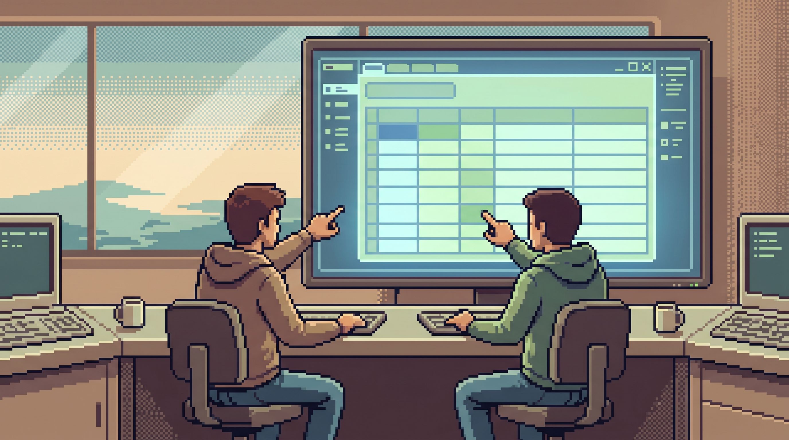
3. Make pair-querying the norm for tricky incidents
Row-level debugging is subtle. Two pairs of eyes help.
Adopt a simple pattern:
- One engineer drives the tool.
- One engineer narrates the story and writes notes.
This is the same posture described in The Calm Pair-Query:
- One shared screen.
- One focused browser like Simpl.
- One linear trail.
Benefits:
- Fewer missed details in rows.
- Faster convergence on a shared mental model.
- A natural trail for postmortems, because someone is narrating in real time.
4. Treat row stories as incident artifacts
Most postmortems include charts. Fewer include row narratives.
Change that:
- Include 1–3 anonymized row examples in your incident doc.
- Write them as short stories: “User A did X, then Y; the system did Z; that violated invariant W.”
- Attach the queries you used in Simpl to reconstruct those stories.
Over time, this builds a shared library of how we actually debug — not just how we graph.
5. Align SLOs and alerts with row-first follow-ups
When you define an SLO or an alert, add a section:
Row follow-up: Once this triggers, what’s the first row-level question we ask, and which table/query do we use to answer it?
Examples:
- “When checkout error rate > 2%, pick a failing
request_idand trace it throughcheckout_eventsandpayments.” - “When job failures spike, pick a single
job_idand read its full lifecycle fromjobsandjob_logs.”
This keeps metrics and rows connected, instead of letting charts float as their own separate universe.
Common failure modes (and how to avoid them)
Even with good intentions, anti-metric sessions can drift. Watch for these patterns.
Failure mode 1: Staying in charts too long
Symptoms:
- You’re 40 minutes into the incident and still adding new panels.
- Nobody can name a single affected user or entity.
Fix:
- Add a rule of thumb: within 10–15 minutes of detection, we must have a canonical example ID.
- Make it someone’s explicit job to find it.
Failure mode 2: Turning the row browser into a mini-BI tool
Symptoms:
- You start building aggregate queries in the incident browser.
- You’re adding GROUP BYs and charts instead of following one entity.
Fix:
- Keep aggregates in your BI tool or metrics stack.
- Treat the row browser as per-entity, per-journey only.
Failure mode 3: Free-form SQL chaos
Symptoms:
- Every engineer writes their own complex joins from scratch.
- Queries get shared as screenshots or Slack snippets with no trail.
Fix:
- Use opinionated, frictioned reads instead of blank-canvas SQL. The ideas in From Free-Form SQL to Frictioned Reads map cleanly onto incident flows.
- Encourage starting from shared, “blessed” queries in Simpl rather than ad-hoc experiments.
Failure mode 4: No read-only guardrails
Symptoms:
- People are afraid to open production data tools during incidents.
- You rely on a small group of “prod wizards” to run all the queries.
Fix:
- Invest in a strictly read-only browser like Simpl for incident work.
- Pair it with a clear policy: “Curiosity in this tool is safe by design.”
This is exactly the posture argued for in The Calm Read-Only Contract.
Bringing it all together
The anti-metric debug session is not an attack on metrics. It’s a reminder of where incidents are actually solved.
- Metrics tell you that something is wrong.
- Rows tell you what is wrong.
- Invariants tell you why it’s wrong.
A calm incident flow looks like this:
- Alert fires; you open the relevant dashboard.
- You frame the incident: when it started, what surface is affected, how big it is.
- You pick a canonical example: one user, one order, one job.
- You open a read-only browser like Simpl and reconstruct the row-level story.
- You fix the underlying invariant and capture the row story in your postmortem.
Over time, this shifts your culture:
- Fewer heroic “graph whisperers.”
- More engineers comfortable reading real production stories.
- Incidents that feel like careful investigation, not dashboard gymnastics.
Start your next incident differently
You don’t need a new stack to try this. You need one deliberate change in your next incident:
The moment you know roughly when and where the problem lives, stop tuning charts and start reading rows.
To make that easier:
- Pick or set up a calm, read-only browser like Simpl.
- Define 3–5 anchor queries for your most critical entities.
- Add a line to your runbook: “Within 15 minutes, we must have a canonical example ID and be looking at its rows.”
The next time a graph moves, treat it as a doorbell, not the whole conversation. Open the door. Go talk to the rows.