The Calm DX Scorecard: Measuring Database Tools by Cognitive Load, Not Checklists


Most teams still evaluate database tools the same way vendors sell them: feature grids, integration lists, pricing tiers, and screenshots.
That’s how you end up with:
- A SQL IDE, a BI tool, three admin panels, and a notebook
- Five ways to run a query, zero ways to stay oriented
- Tools that look powerful in a demo and feel heavy during an incident
This post argues for a different evaluation lens: a Calm DX Scorecard that measures database tools by the cognitive load they impose, not the number of boxes they tick.
Developer experience around data is not primarily a feature problem. It’s an attention problem.
Tools like Simpl are built around this stance: an opinionated database browser that optimizes for calm, focused reading of production data instead of maximal flexibility. A scorecard rooted in cognitive load is how you tell whether a tool is actually helping you do that.
Why cognitive load is the real metric
When you’re tracing a subtle billing bug, answering a support escalation, or explaining what happened in production, your limiting resource is not CPU or storage. It’s working memory.
Every extra choice your tools force on you consumes that memory:
- Which panel should I look at first?
- Is this query safe to run in production?
- Which environment is this tab pointed at?
- Am I looking at the right tenant, user, or time range?
You feel it as:
- Hesitation before you press Enter
- A Slack thread you keep rereading to remember the original question
- A browser full of tabs you’re afraid to close
Traditional evaluations ignore this. They compare:
- Number of integrations
- Breadth of SQL support
- Chart types and visualization options
- Admin and write capabilities
Those things matter. But they’re secondary to a simpler question:
How much mental effort does this tool demand per minute of real work?
If you’ve read our piece on focus-first database tooling, this is the same idea, turned into something you can actually score.
What a Calm DX Scorecard looks like
A Calm DX Scorecard is a small set of questions you can apply to any database tool — from a full BI suite to a narrow browser like Simpl.
You’re not trying to be perfectly objective. You’re trying to be consistent.
We’ll group the scorecard into five dimensions:
- Entry friction – How hard is it to start from a real question?
- Navigation posture – How do you move from question to rows?
- Workspace shape – What does “doing the work” actually look like?
- Safety posture – How much do you have to think about not breaking things?
- Narrative support – How well does the tool help you keep and share the story?
Each dimension can be scored on a simple 1–5 scale, where 1 = loud and heavy, 5 = calm and legible.
You don’t need a formal rubric to get value. But writing scores down — and comparing them across tools — forces conversations that a feature checklist never will.
1. Entry friction: Starting from a real question
Entry friction is everything between “I have a question” and “I’m looking at relevant rows.”
Ask these questions:
- How many decisions do I make before I see data?
- Pick a connection, environment, schema, workspace, chart type?
- Does the tool start from schema, or from intent?
- Are you dumped into an object tree, or guided by the question you’re asking?
- How many clicks from the original artifact to the data?
- From stack trace, support ticket, or user ID to rows that matter.
A low-friction tool might:
- Let you paste a user ID or order ID into a single search box
- Offer direct deep-links from logs, error trackers, or tickets
- Default to the right environment and tenant for incident work
If you’ve experimented with a single-database day, you’ve already felt the upside of low entry friction: less “setup” time, more time actually reading data.
Score guidance:
- 1–2: You always start from a blank canvas or schema tree. Multiple prompts before you see a row.
- 3–4: Some shortcuts from real-world identifiers, but still a lot of setup.
- 5: One or two decisions from real question to relevant rows, consistently.

2. Navigation posture: From schema mazes to intent-first moves
Once you’re in the tool, how do you move?
Most database tools still assume schema-first navigation:
- Schemas → tables → columns
- Join builders, query history, tab forests
That works for exploration. It’s brittle under pressure.
Instead, look for intent-first navigation — the patterns we dug into in Beyond Object Trees:
- “Show me everything about this user.”
- “Follow this subscription across time.”
- “What changed for this invoice between these two timestamps?”
Score your tool on:
- Contextual moves. From a row, can you:
- Jump to related rows (foreign keys, events, jobs) in one click?
- Time-travel this record to a past state?
- Pivot from a user to their orders, then to payments, without rebuilding queries from scratch?
- Trail legibility. As you navigate, does the tool leave a clear trail of where you’ve been and why, or just a pile of tabs?
Score guidance:
- 1–2: You mostly drive by writing or editing SQL and clicking around object trees.
- 3–4: Some relational shortcuts, but you still reconstruct context manually.
- 5: Navigation feels like following a story, not assembling a query every time.
This is where opinionated tools like Simpl tend to shine: they assume you’re following a narrative through your data, not building dashboards.
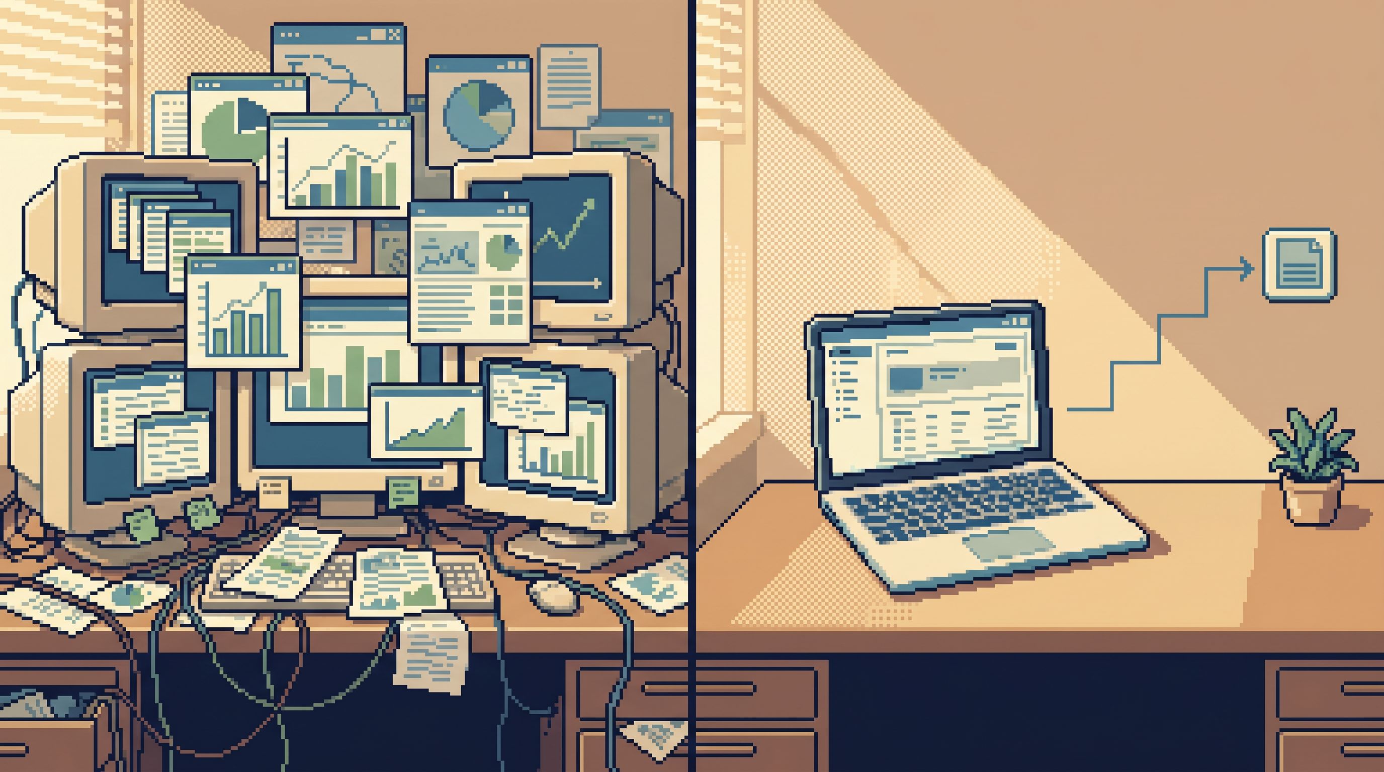
3. Workspace shape: One surface or a cockpit of panels?
The shape of the workspace is one of the strongest predictors of cognitive load.
Ask:
- How many surfaces are “primary” while you work?
- Query editor, results grid, schema browser, chart panel, logs, console?
- Does the tool encourage panel hoarding?
- Tabs, tiles, timelines, layouts — or one main surface?
- Can you run a whole debug session from one intent?
If you’ve explored the idea of post-workspace browsers or database work without multitasking, you know the pattern:
- One primary surface
- One clear question at a time
- A linear trail of moves
Score guidance:
- 1–2: Feels like a cockpit: multiple panels, custom layouts, and timelines are the default.
- 3–4: Panels exist but can be tamed; you can collapse down to one main area with effort.
- 5: The tool is opinionated about a single working surface, with extra context only when needed.
This isn’t about aesthetics. It’s about whether your working memory is tracking the data, or tracking the layout you built to see the data.
4. Safety posture: How much fear is in the loop?
You can’t have calm database work if everyone is quietly afraid of making a mistake.
Look at how the tool handles safety within the flow, not just in permissions setup. (We wrote more on this in Guardrails in the Flow, Not the Setup.)
Questions to ask:
- Is read-only the default?
- Or is every session a potential write session unless you’re careful?
- Are dangerous actions visually and mechanically distinct?
- Clear separation between “look” and “change.”
- Does the interface encourage experimentation, or hesitation?
- Are you comfortable trying a new filter, or worried about running the wrong statement?
Opinionated browsers like Simpl lean hard into a calm read-only contract: production reads are safe by design; write-adjacent actions, if any, are narrow and explicit.
Score guidance:
- 1–2: You constantly double-check which environment and permissions you’re using. The same editor can drop a table and run a select.
- 3–4: Permissions are better scoped, but the interface still feels like a general-purpose SQL IDE.
- 5: It’s hard to do something dangerous by accident. The tool makes “just reading” feel obviously safe.
The less time you spend worrying about safety, the more cognitive budget you have for the actual question.
5. Narrative support: Keeping the story, not just the query
Most debugging sessions end with a handful of people who “kind of” understand what happened, and a collection of half-saved queries, screenshots, and Slack threads.
A calm database tool should help you capture and replay the story, not just run queries.
Ask:
- Can you see a linear trail of what you looked at?
- Not just query history, but the sequence of pivots, filters, and jumps.
- Can you name or annotate steps?
- “Checked user’s subscription before downgrade,” “Compared invoice totals before and after migration,” etc.
- Can others replay the investigation?
- A link that loads the same trail, not just a single query.
We go deeper on this in From Tables to Stories: the goal is to turn raw reads into sharable debug narratives.
Score guidance:
- 1–2: You have query history and maybe saved dashboards, but no sense of a narrative.
- 3–4: You can save and share some flows, but it’s not the default way to work.
- 5: Every debug session naturally becomes a replayable story, with minimal extra effort.
This is where “calm” becomes cultural, not just visual. A team that can replay its own investigations learns faster and sleeps better.
Turning the scorecard into a practical evaluation
A scorecard is only useful if it changes real decisions.
Here’s a simple way to use the Calm DX Scorecard on your team.
1. Pick one real workflow
Don’t evaluate tools in a vacuum. Use a concrete, familiar scenario:
- “A high-value customer’s invoice changed unexpectedly.”
- “Signups dropped 20% after a deploy.”
- “Support escalates a user who can’t access a feature they paid for.”
For each candidate tool (including what you use today), run that scenario end-to-end.
2. Score as you go
For each dimension, ask people to rate their experience 1–5:
- Entry friction
- Navigation posture
- Workspace shape
- Safety posture
- Narrative support
Encourage short notes, not essays:
- “Felt lost in tabs by minute 10.”
- “Couldn’t tell if I was in prod or staging without squinting.”
- “One search box got me to the user in two steps.”
3. Compare tools on the shape of scores, not just the average
You don’t need a perfect score.
Instead, look at patterns:
- A tool with strong navigation and narrative, but weak safety, might be fine for staging and off-limits for production.
- A calm, read-only browser like Simpl might score high on safety and workspace shape, making it ideal as the primary surface during incidents, with heavier tools orbiting it.
This mirrors the idea from The Quiet DX Upgrade: you don’t have to rip out everything. You can deliberately shrink the number of tools that sit in the center of your incident and debugging loops.
4. Bake the scorecard into procurement and design
The scorecard is not just for buying tools. It’s also for designing them.
When you’re:
- Adding a new panel
- Introducing a new mode
- Wiring in a new integration
Ask:
- Does this raise or lower entry friction?
- Does this encourage a cockpit workspace, or a single surface?
- Does this make the narrative easier to follow and share?
If the answer is “higher cognitive load,” the feature should justify itself explicitly — not just exist because it’s easy to ship.
A calm benchmark: What “good” feels like
It’s helpful to have a mental benchmark for a high Calm DX score.
A tool that scores 4–5 across the board tends to feel like this:
- You start from a ticket, stack trace, or user ID and land on relevant rows in under five clicks.
- You rarely think about environments or permissions; production reads feel safe by default.
- The interface shows one main surface, with extra context only when you ask for it.
- Navigation feels like following a story — from user → subscription → invoices → jobs — instead of constantly rewriting SQL.
- At the end of an incident, you can share a single link that walks someone else through the exact path you took.
This is the posture Simpl is designed around. Not because it’s the only way to work with data, but because it’s the calmest way to do the production-facing parts of that work.
Summary
Evaluating database tools by feature checklists leads to noisy stacks and stressed engineers. A Calm DX Scorecard flips the evaluation lens to focus on cognitive load — how many decisions a tool demands per minute of real work.
By scoring tools across five dimensions:
- Entry friction
- Navigation posture
- Workspace shape
- Safety posture
- Narrative support
…you get a clearer picture of which tools actually support calm, focused database work.
You’ll likely discover that:
- Some of your “powerful” tools are too loud to sit in the center of incident workflows.
- A narrower, opinionated browser like Simpl makes a better primary surface for production reads.
- Small UX choices — one search box, one surface, a visible trail — matter more than another integration on a pricing slide.
The goal isn’t fewer tools for its own sake. It’s a stack where your attention goes to the data and the story, not the workspace.
First steps: Run one real scenario through your stack
You don’t need a committee or a full RFP to start using the Calm DX Scorecard.
Pick one real incident or support scenario from the last month and:
- Replay it in your current tools.
- Time how long it takes to get from the original artifact (ticket, trace, alert) to relevant rows.
- Notice where your attention goes: the data, or the interface.
- Score each tool you used on the five dimensions.
- Be honest, but not perfectionist. You’re looking for patterns, not precision.
- Try the same scenario in a calmer surface.
- If you have access to Simpl, point it at a replica or safe environment and run the same path.
- Compare how your attention feels, not just how fast the queries run.
- Decide what should be primary.
- Choose one tool to sit at the center of your next incident or deep debug session.
- Let everything else orbit it.
Once you’ve done this once, the scorecard will stop being a document and start being a reflex: a quiet question you ask every time you touch a new data tool.
Does this make my work calmer, or louder?
That’s the only metric that matters when the stakes are high and the data is real.