The Anti-Dashboard Database: Designing Views That Don’t Beg for Your Attention

Dashboards won.
They sit on big screens, glow in war rooms, and show up as the default homepage in half the tools your team uses.
But most database work is not dashboard work.
When you’re:
- Tracing a single user’s billing issue
- Verifying what a background job actually did
- Following an incident through a few key tables
you don’t need a wall of charts. You need a quiet, precise view into the data.
This is where the anti-dashboard database comes in: views that don’t beg for your attention, don’t animate at you, and don’t try to summarize the world. They just help you answer the question in front of you—calmly.
Tools like Simpl are built around that stance: an opinionated database browser that favors focused, read-heavy views over dashboard sprawl.
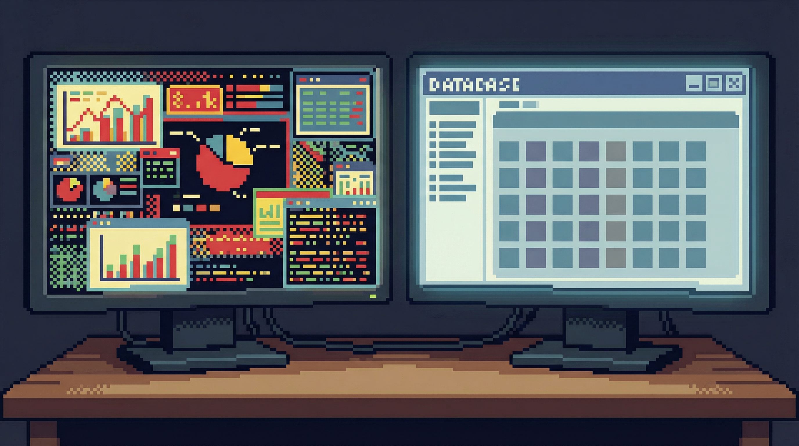
Why dashboards are the wrong default for database work
Dashboards are built for monitoring. Database work is usually about understanding.
A monitoring stance assumes:
- You care about the same metrics every day
- You want to notice changes quickly
- You’re scanning, not investigating
But most engineers touch production data in a very different mode:
- You have one concrete question
- You need a small number of precise facts
- You care more about trusting the answer than seeing a lot at once
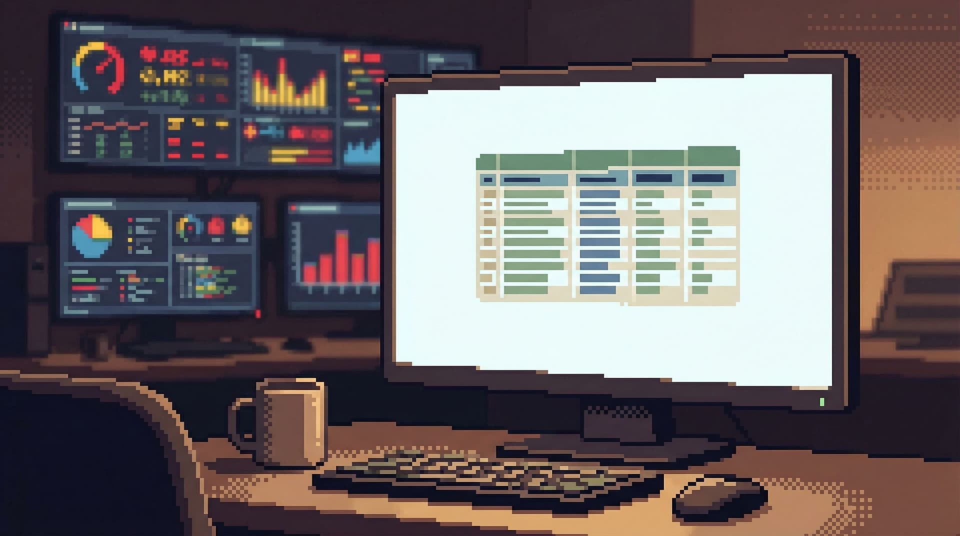
When you bring a dashboard mindset into this kind of work, you get:
- Overload by default – Dozens of panels, each “maybe relevant,” none clearly the next step.
- Context loss – You jump between charts and queries without a clear trail from question to answer.
- Shallow understanding – You see shapes and trends, but not the specific rows, relationships, and edge cases that actually explain what happened.
If this feels familiar, you may want to read more about why engineering teams need different tools than BI dashboards in From Dashboards to Drilldowns: Why Engineering Teams Need a Different Kind of Data Tool.
The anti-dashboard stance says: database views should help you think slowly, not scan quickly.
What an anti-dashboard database view looks like
An anti-dashboard view is not just “less charts.” It’s a different set of defaults.
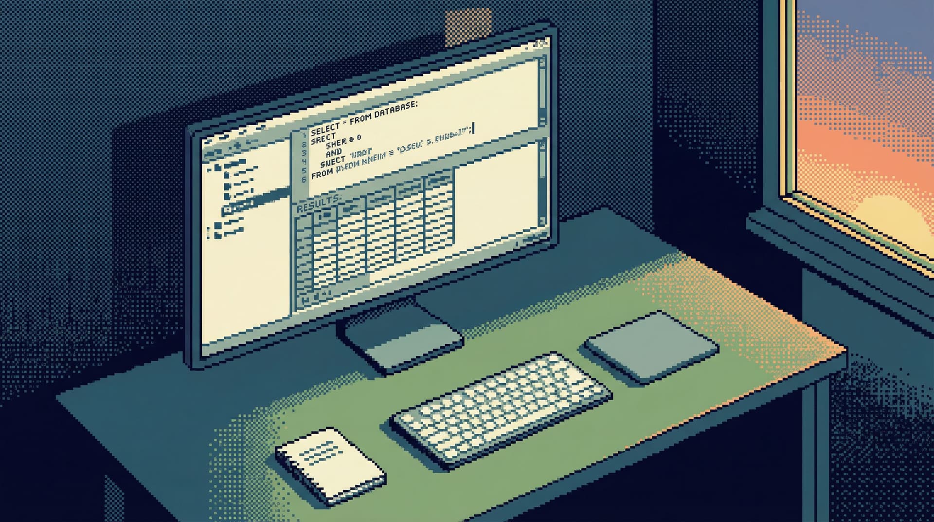
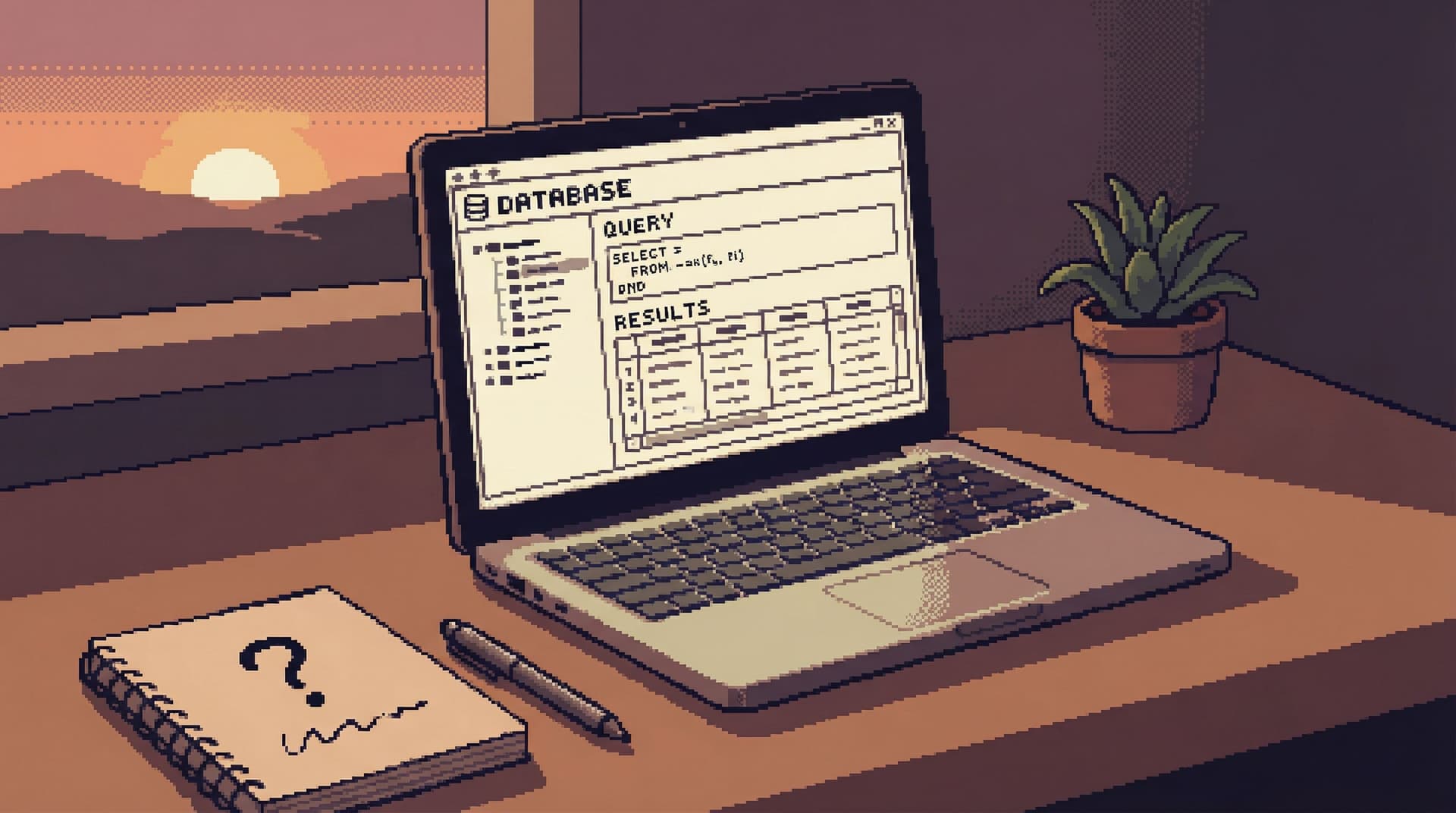
1. Rows, not tiles
Instead of a mosaic of panels, you see:
- A single table or joined result set
- A small, opinionated set of columns
- Clear filters that map directly to the question you’re asking
The unit of work is a record, not a chart.
2. One question at a time
The interface nudges you toward:
- One active query or view in focus
- Minimal or no tabs
- A visible trail of how you got here, not 10 parallel paths
This aligns with the "one-query" stance described in The One-Query Mindset: Structuring Database Work to Avoid Cognitive Thrash.
3. Calm by design
Anti-dashboard views avoid:
- Live auto-refresh unless you explicitly ask for it
- Animations, pulsing indicators, or color noise
- Surprise state changes that move the screen while you’re reading
Instead, they lean on:
- Static, legible tables
- Subtle, consistent emphasis (e.g., muted colors, clear typography)
- Deliberate refresh actions
4. Story over schema
You don’t start from a tree of tables. You start from a story:
- “This user’s subscription renewal”
- “This payout batch run”
- “This incident’s affected jobs”
The view is structured around that story, even if it spans multiple tables or services. If you want to go deeper on this idea, see Less Schema, More Story: Helping Engineers Navigate Databases by Use Case, Not Object List.
Principles for designing views that stay quiet
If you’re designing internal tools, or configuring something like Simpl for your team, you can bake the anti-dashboard stance into the way views work.
Here are concrete principles to start from.
1. Make “nothing happening” the default
Most tools assume the UI should always be doing something: refreshing, animating, suggesting.
For database views, flip that:
- No auto-refresh by default. Let people opt into a refresh cadence only when they’re truly monitoring, not investigating.
- No background polling just to keep things "live." If the data is static for the question at hand, the UI should be too.
- Keep layout still. Avoid elements that slide in/out or resize the main content while someone is reading.
The benefit:
- Less visual noise
- Fewer surprises
- A stronger sense that “what I see now is exactly what I asked for”
2. Narrow the query surface
The more arbitrary the query surface, the more the UI has to compensate with dashboards and charts.
Instead, constrain what can be asked from each view:
- Predefine the main filters. Map them to real questions:
user_id,order_id,job_run_id,time range. - Hide irrelevant columns by default. Show only what typically matters for that use case; let people reveal more if needed.
- Avoid free-text everywhere. It’s fine for advanced paths, but the main path should feel like selecting from a small set of known-good levers.
This is the same stance as the narrow, opinionated query surface described in The Narrow Query Surface: Designing Database Tools That Encourage Only the Right Questions.
3. Design for read-heavy work first
Most database sessions should be read-only, or at least read-first.
Your views should make that obvious:
- Read actions front and center. Filters, sorting, drilldowns, pagination.
- Write actions visually and spatially separated. Different region, different color, extra confirmation.
- No inline editing in primary tables. It’s tempting; it’s also how accidental writes become normal.
A tool like Simpl leans into this: it’s a database browser, not an admin panel. You can explore deeply without feeling like one stray click will mutate production.
4. Prefer depth over breadth
Dashboards try to show many things at once. Anti-dashboard views try to show one thing very clearly.
Design for depth:
- Drilldown over overview. Clicking into a row should reveal a richer, more legible story about that record, not just more charts.
- Linked views, not more widgets. From a user row, jump to their invoices, jobs, and events as separate, focused views—not embedded mini-dashboards.
- Breadcrumbs instead of tabs. Let people walk a linear path:
Users → User 123 → Invoices → Invoice 987, and easily step back.
The mental model: a narrow, well-lit hallway, not an open-plan control room.
5. Let the trail do the talking
A quiet view doesn’t mean a quiet workflow. You still want a record of what happened.
Instead of a dashboard history, keep a read trail:
- Which views were opened
- Which filters were applied
- Which records were inspected
This trail should be:
- Linear and readable – something you can share in Slack without extra explanation.
- Reproducible – someone else can click the same links and see the same state.
- Persistent – not lost when you close the tab.
This is the core idea behind treating database sessions as narratives, not logs, as explored in Read Trails, Not Logs: Turning Database Sessions into Shareable Narratives.
Concrete patterns you can implement this week
You don’t need to rebuild your tools from scratch. You can move toward an anti-dashboard stance with a few targeted changes.
1. Replace one dashboard with a focused view
Pick a dashboard that:
- Rarely drives decisions directly
- Is mostly used as a starting point for debugging
- Has overlapping or redundant panels
Then:
- Identify the three most common questions people actually use it for.
- Create one focused view per question, each with:
- A narrow set of filters
- A single main table or result set
- Clear drilldowns to related data
- Link to these views directly from your incident runbooks, docs, or Slack shortcuts.
- Retire or hide the old dashboard for most users.
Measure success by:
- Fewer screenshots in Slack
- More shared links to specific views
- Shorter time from “question asked” to “query run”
2. Turn off auto-refresh where it doesn’t help
Audit your existing dashboards and database tools:
- Where is auto-refresh enabled?
- Which of those are truly monitoring use cases vs. investigation use cases?
For any view that’s primarily investigative:
- Turn off auto-refresh by default
- Add a clear, manual Refresh button
- If you must keep live data, make the cadence explicit (e.g., “Updates every 60s”) without animation
You’ll notice:
- Less UI jitter
- Fewer “wait, it just changed” moments
- A calmer baseline for reading and thinking
3. Hide 50% of columns by default
Most tables ship with far more columns than any single question needs.
For your most-used investigative views:
- List all columns currently visible.
- For each, ask: Is this essential to the core question of this view?
- Hide everything that isn’t.
- Add a simple “Show more fields” affordance for advanced use.
This small change:
- Reduces horizontal scrolling
- Makes patterns and anomalies easier to see
- Encourages you to think about what each view is actually for
4. Separate “monitoring” and “debugging” entry points
If you must keep dashboards, at least separate:
- Monitoring entry points – high-level metrics, alerts, SLIs
- Debugging entry points – focused, row-level views into key entities
Make it clear in navigation:
- Monitoring: “Overview,” “Health,” “SLIs”
- Debugging: “User lookup,” “Invoice runs,” “Job executions”
And when an alert fires, link directly to the debugging views, not back to the monitoring dashboard.
5. Use tools that are opinionated about calm
Some tools are built to be dashboards. Some are built to be quiet.
If you’re doing read-heavy, investigative work, prefer tools that:
- Default to tables and filters, not charts and tiles
- Encourage one active query or view at a time
- Make read-only, production-safe workflows the norm
That’s the stance behind Simpl: a calm, opinionated database browser that helps teams explore, query, and understand data without turning every session into a dashboard design exercise.
How anti-dashboard views change team behavior
This isn’t just about aesthetics. When your database views stop begging for attention, team behavior shifts.
1. Less thrash during incidents
Instead of everyone opening their own mix of dashboards and tools, you get:
- Shared, linear read trails
- Clear handoffs (“start from this view, then click into this user, then this job”)
- Fewer side quests into unrelated metrics
This aligns with calmer incident workflows like those described in Production Incidents Without the Maze and Production Reads Without the Rabbit Holes.
2. Safer production habits
When views are clearly read-first and write actions feel rare and deliberate:
- People are less likely to “just try” a risky query in the middle of debugging
- You rely less on policy and more on UX guardrails
- Production data feels serious, but not scary
This pairs well with the guardrail stance from Guardrails as UX, Not Policy: Turning Risky Database Actions into Rare, Deliberate Moments.
3. Better knowledge sharing
Anti-dashboard views, combined with read trails, make it easier to:
- Share a link instead of a screenshot
- Reproduce someone else’s investigation step by step
- Turn one-off queries into reusable, named views
Over time, your “database knowledge” stops living in heads and incident channels and starts living in calm, shareable views.
A quick checklist for your own tools
Use this as a short audit of your current database experience:
- [ ] Do most investigative sessions start on a dashboard?
- [ ] Do you rely on auto-refresh in views that are about understanding, not monitoring?
- [ ] Are your main tables cluttered with columns no one can explain?
- [ ] Do write actions feel visually and spatially similar to read actions?
- [ ] Do people share screenshots more often than links to specific views?
- [ ] Do you need multiple tools open just to follow a single user story through the data?
If you checked more than a couple of these, you’re living in a dashboard-first world for a problem that wants anti-dashboards.
Summary
Anti-dashboard database views are not about being spartan for its own sake. They’re about matching the tool to the work:
- Monitoring wants dashboards.
- Understanding wants quiet, precise, story-shaped views.
By narrowing the query surface, turning off unnecessary motion, designing for read-heavy workflows, and emphasizing depth over breadth, you create an environment where:
- Incidents feel more linear
- Production feels safer
- Knowledge is easier to share
Tools like Simpl embody this stance: a calm, opinionated database browser that helps teams explore production data without turning every question into a dashboard problem.
Take the first step toward an anti-dashboard stance
You don’t need a full redesign. Start small:
- Pick one noisy dashboard that people secretly dislike.
- Replace it with a single, focused view built around a concrete question.
- Turn off auto-refresh, hide non-essential columns, and add clear drilldowns.
- Share that view during your next incident or debugging session.
Notice how it feels to work this way.
If you want a tool that’s built around these ideas from the start, try Simpl as your read-first database browser. Use it for your next production investigation and see what changes when your database views stop competing for your attention—and start quietly answering your questions instead.