From BI Sprawl to Focused Reads: Separating Exploration from Reporting in Your Data Stack


Most teams don’t suffer from a lack of BI.
They suffer from too much of it in the wrong places.
Dozens of dashboards. Multiple BI tools. Competing metrics. And when something actually breaks in production, the people closest to the problem quietly open a SQL client or admin panel and start from scratch.
This post is about a simple but underrated move:
Separate exploration from reporting. Treat them as different jobs with different tools, constraints, and expectations.
When you do that, three things happen:
- Your BI layer gets calmer and more trustworthy.
- Your engineers get a focused, safe way to read production data.
- Your data stack stops feeling like a maze and starts feeling like a set of clear paths.
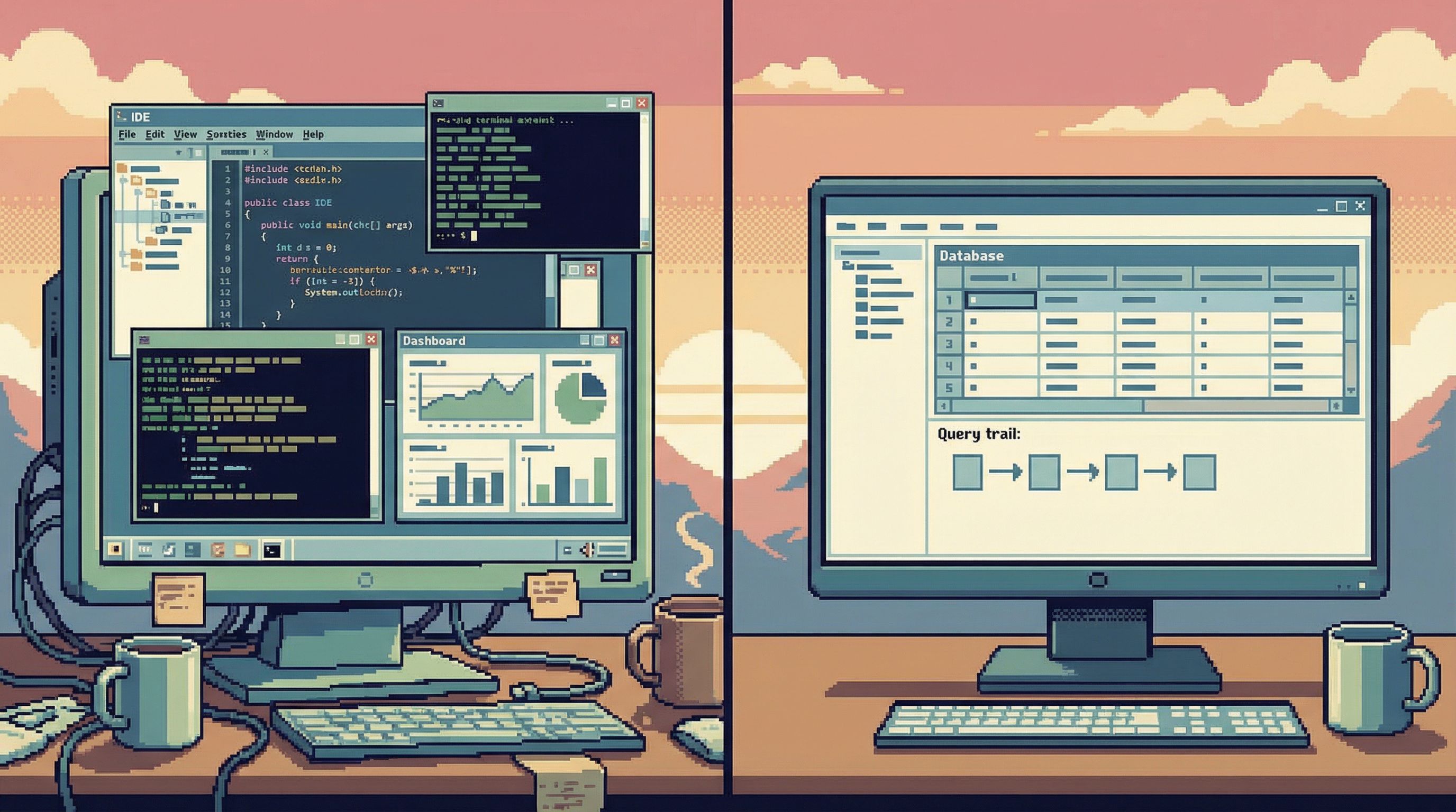
Tools like Simpl are built around that separation: an opinionated database browser for focused reads, not another canvas for dashboards.
Why This Separation Matters
Most stacks evolved around one idea: “Put everything in BI.”
- Self‑serve analytics? Add more dashboards.
- Executive reporting? More dashboards.
- Debug a billing issue? Someone adds a dashboard.
- Investigate a spike? Temporary dashboard that never dies.
The result is what many teams now call dashboard or BI sprawl:
- Hundreds of overlapping dashboards with no clear owner.
- Conflicting definitions of core metrics like "churn" or "active user".
- Stakeholders spending more time hunting for the “right” dashboard than interpreting the data.
Industry surveys echo this: a large share of data leaders report that too many tools and fragmented dashboards are a daily struggle, and that consolidation is now a top priority for BI programs.
At the same time, engineers and data‑savvy folks doing day‑to‑day work rarely want another dashboard. They want:
- A precise view of a single user, job, or incident.
- A clear, linear way to follow data across tables.
- Confidence that they won’t accidentally break production.
Those needs don’t fit well in a general‑purpose BI tool. They’re closer to what we’ve written about in posts like “From Dashboards to Drilldowns: Why Engineering Teams Need a Different Kind of Data Tool” and “The Calm Query Stack: Designing a Minimal Toolkit for Everyday Database Work”.
The core problem:
Reporting is about stable, shared answers. Exploration is about local, evolving questions.
Trying to solve both with the same tools and patterns is how you get sprawl, confusion, and fragile workflows.
Two Very Different Jobs Hiding Under “Analytics”
Let’s name the two modes.
Mode 1: Reporting
Reporting is about consistent, repeatable views of the business:
- Monthly revenue and churn.
- Product adoption by segment.
- Support backlog trends.
- SLAs and SLOs.
Characteristics:
- Stable questions. The shape of the question changes slowly.
- Shared audience. Many people rely on the same view.
- Governed definitions. Metrics need clear owners and semantics.
- Time‑bound cadence. Weekly, monthly, quarterly.
Good reporting feels boring on purpose. It’s the same view, updated.
Mode 2: Exploration
Exploration is about local, situational questions:
- “Why did this specific user get double‑charged?”
- “What actually happened in this migration last night?”
- “Why does this cohort’s activation look off?”
Characteristics:
- Ephemeral questions. Many are one‑off or short‑lived.
- Narrow audience. A few people care, for a short window.
- Messy path. You’ll backtrack, refine, and follow hunches.
- Higher risk surface. Often touches production data directly.
Good exploration feels focused and reversible. You can see your trail, undo steps, and share the story if it turns out to matter.
When you blur these modes, you get:
- Dashboards that try to serve both executives and on‑call engineers.
- Ad‑hoc debug views that quietly become “official” reports.
- BI tools overloaded with drilldowns, SQL editors, and write paths.
The fix is not another tool. It’s a deliberate split in responsibilities and interfaces.
Principle: One Stack for Answers, One Stack for Questions
A calm data stack treats reporting and exploration as two different products:
- Reporting stack: semantic layer, governed metrics, curated dashboards.
- Exploration stack: focused database browser, safe read paths, linear trails.
They may share the same warehouse, but they don’t share the same UX or expectations.
Here’s how that separation looks in practice.
1. Make Reporting a Narrow, Curated Surface
Reporting should be the smallest, clearest set of views that leadership and teams actually rely on.
Concretely:
- Name the canonical metrics. Decide which definitions of revenue, churn, active user, etc. are official, and encode them in a semantic layer (dbt models, LookML, etc.).
- Retire zombie dashboards. Archive or delete dashboards with no meaningful usage in the last 60–90 days.
- Reduce entry points. Instead of 30 folders in your BI tool, maintain a small, well‑labeled set of spaces: “Executive”, “Product”, “Revenue”, “Ops”.
- Separate “lab” from “library”. Give analysts a scratch area that is explicitly non‑canonical. Nothing moves into the main library without review.
This is the same stance we argued for in “The Anti‑Dashboard Database: Designing Views That Don’t Beg for Your Attention”: views should exist to answer a recurring question, not to decorate a wall.

2. Give Exploration Its Own Home
If every exploratory question has to squeeze through your BI tool, it will either:
- Bloat the BI layer with one‑off artifacts, or
- Push engineers back to risky admin panels and raw SQL clients.
Instead, give exploration a dedicated interface designed for read‑heavy work.
A good exploration tool (this is where Simpl lives) should:
- Default to read‑only. Writes are either impossible or clearly separated and heavily guarded.
- Center on records, not charts. It should be trivial to pull up a single user, job, or event stream and follow relationships.
- Support linear trails. You can see and share the sequence of queries and views that led to an answer.
- Avoid dashboard metaphors. No tiles, no “build your own KPI page,” no temptation to turn every debug session into a report.
The goal is not another BI tool. It’s a quiet, purpose‑built browser for your database.
This is the stance behind posts like “Beyond Admin Panels: What a Purpose‑Built Database Browser Should (and Shouldn’t) Do” and “The Single‑Window Database Session”: one window, one question, one calm path through the data.
A Practical Path Away from BI Sprawl
You don’t have to rebuild your stack to separate exploration from reporting. You can incrementally re‑draw the boundary.
Here’s a concrete sequence you can run over a quarter.
Step 1: Map Where Questions Actually Go
Spend two weeks logging where data questions are answered:
- Executive metrics → BI dashboard.
- PM investigating a feature → ad‑hoc SQL in an IDE.
- On‑call debugging an incident → admin panel + logs.
- Finance reconciling invoices → spreadsheet + exports.
Tag each with:
- Mode: reporting vs exploration.
- Tool: which interface.
- Risk: read‑only vs read/write, prod vs replica.
You’ll usually find:
- Reporting questions spread across too many dashboards.
- Exploration questions scattered across tools that were never designed for calm, safe reads.
That inventory becomes your roadmap.
Step 2: Tighten the Reporting Surface
Pick one domain (e.g., revenue or product usage) and:
- Define the core questions. What do leaders and teams need every week or month?
- Audit existing dashboards. For each, ask: does this answer a core question, or was it a one‑off?
- Consolidate. Merge overlapping dashboards into a smaller set, backed by shared models.
- Label clearly. Use naming conventions like
EXEC – Revenue OverviewvsLAB – Revenue Experiments.
Run this as a recurring practice, not a one‑time cleanup. Every new dashboard should answer:
- Who owns it?
- Who uses it?
- What recurring decision does it support?
If you can’t answer those, it probably belongs in an exploratory tool or a scratch space, not the canonical library.
Step 3: Carve Out a Dedicated Exploration Path
For exploration, the question is simple:
Where do we want engineers and analysts to go first when they need to look directly at data?
If the honest answer today is “psql” or “the production admin panel,” you have an opportunity.
Design a new default path with these constraints:
- Read‑only by default. No UPDATE/DELETE/TRUNCATE in the same interface where people routinely debug.
- Narrow query surface. Encourage simple, bounded queries over “type anything” canvases.
- Environment clarity. Make it impossible to confuse staging with production.
- Visible trails. Sessions should leave behind readable traces that others can follow.
This is the niche Simpl is built for: a calm, opinionated database browser that assumes you’re mostly reading, not writing.
You don’t have to roll it out to everyone at once. Start with:
- On‑call engineers.
- Data engineers handling incidents.
- A few PMs or analysts who frequently ask “can someone pull this from the database?”
Give them a single, safe place to go for focused reads, and route exploratory work there instead of into BI.
Step 4: Make It Social: From One‑Off Queries to Shared Trails
One reason BI sprawl happens is that every question gets answered in isolation:
- Someone debugs a tricky billing edge case.
- They run ten queries, piece together a story.
- The answer ends up as a Slack screenshot.
Next month, someone else repeats the process.
When exploration happens in a dedicated browser with shareable read trails, you can:
- Link directly to a past investigation.
- Re‑run the same sequence on a different user or time range.
- Promote a trail into a semi‑formal runbook.
Over time, this creates a third layer between raw exploration and formal reporting:
- Not a dashboard.
- Not a throwaway query.
- A reusable narrative you can hand to the next person.
This is the idea behind “Read Trails, Not Logs: Turning Database Sessions into Shareable Narratives” and “From Cursor to Conversation”: treat each exploratory session as something that might matter again.
Step 5: Decide Explicitly What Graduates Into BI
Finally, create a promotion rule:
- Exploratory work starts in the database browser.
- If a question recurs, or its answer needs a wide audience, it graduates into BI as a report.
A simple checklist before something becomes a dashboard:
- Has this question been asked at least 3–5 times by different people?
- Is the answer stable enough to be refreshed on a schedule?
- Do we have clear metric definitions and owners?
If yes, it belongs in the reporting stack.
If not, it stays in exploration—where it can be messy, local, and fast without polluting your BI layer.
How This Changes Day‑to‑Day Work
Once you separate exploration from reporting, a few things get noticeably calmer.
For Engineers
- Less fear around production. A read‑only, focused browser makes it clear what’s safe.
- Fewer tool hops. You don’t need a BI tab, an IDE, and an admin panel open to debug a single issue.
- Cleaner mental model. Dashboards are for “how are we doing?”; the browser is for “what exactly happened?”
For Analysts
- BI isn’t a dumping ground. You’re not forced to encode every question as a dashboard.
- Governance gets easier. Fewer “mystery” dashboards to maintain.
- Clearer career leverage. You spend more time on defining metrics and models, less on one‑off fire drills.
For Stakeholders
- More trust in dashboards. When fewer, better‑governed dashboards exist, arguments over “which number is right” drop.
- Faster answers to edge cases. Engineers and analysts can investigate without bloating BI or risking production.
Most importantly: your data stack starts to feel legible again. There’s a clear answer to “where do I go for this kind of question?”
Bringing It Back to Calm Data
The theme running through all of this is simple:
Calm comes from constraints.
- Constraints on what gets to be a dashboard.
- Constraints on where exploratory work lives.
- Constraints on how dangerous actions show up in the UI.
Separating exploration from reporting is one of the highest‑leverage constraints you can add to your stack. It doesn’t require a re‑platform. It requires drawing a line and sticking to it.
If you want a concrete first move:
- Pick one messy domain (billing, subscriptions, or incidents).
- Clean up the BI surface for that domain.
- Give the people closest to the work a focused, read‑only browser—something like Simpl—and route exploration there.
- Watch how often exploratory trails naturally suggest better, tighter reports.
Over a few months, you’ll see the shape of your stack change:
- Fewer, clearer dashboards.
- Richer, more reusable exploratory trails.
- A calmer way to touch production data.
Summary
- Reporting and exploration are different jobs. Reporting is stable, shared, and governed. Exploration is local, messy, and often tied to production.
- BI sprawl comes from mixing those jobs. Dashboards try to do everything; engineers flee to risky tools; trust erodes.
- A calm stack separates concerns. Use a narrow, curated BI layer for canonical answers, and a focused database browser for read‑heavy exploration.
- You can get there incrementally. Map current workflows, tighten BI, introduce a dedicated exploration path, and define promotion rules from trails to dashboards.
- The payoff is clarity. Teams know where to go for which questions, production feels safer, and your data tools stop shouting over each other.
Take the First Step
You don’t need a big initiative to start.
This week, pick one recurring exploratory task—debugging a user issue, tracing an incident, validating a migration. Instead of opening a BI tool or a write‑capable client, run it through a focused, read‑only browser like Simpl.
Notice what changes:
- How many fewer tabs you need.
- How much easier it is to share the trail afterward.
- How little you miss having a dashboard for this kind of work.
From there, you can start drawing a clearer line in your own stack:
- Dashboards for answers you want to see again.
- Focused reads for questions you just need to understand right now.
That line is where BI sprawl ends—and calm, focused database work begins.