From BI Fatigue to Focused Reads: A Developer’s Guide to Escaping Dashboard Overload


Business intelligence tools weren’t built for how you actually debug.
They’re great at:
- Telling you a metric is off
- Summarizing the last week or quarter
- Giving leaders a sense of direction
They’re not great at:
- Explaining a single user’s broken journey
- Answering “what changed between yesterday and now?”
- Supporting a two‑hour incident where you live inside rows, not charts
So teams quietly bend BI into something it was never meant to be: a general‑purpose window into production. The result is familiar: tab sprawl, dashboard hunting, and a constant, low‑grade fatigue every time you “go look at the data.”
This post is about a calmer alternative: moving from BI fatigue to focused reads. Less wall‑of‑tiles, more deliberate trails through the rows that matter.
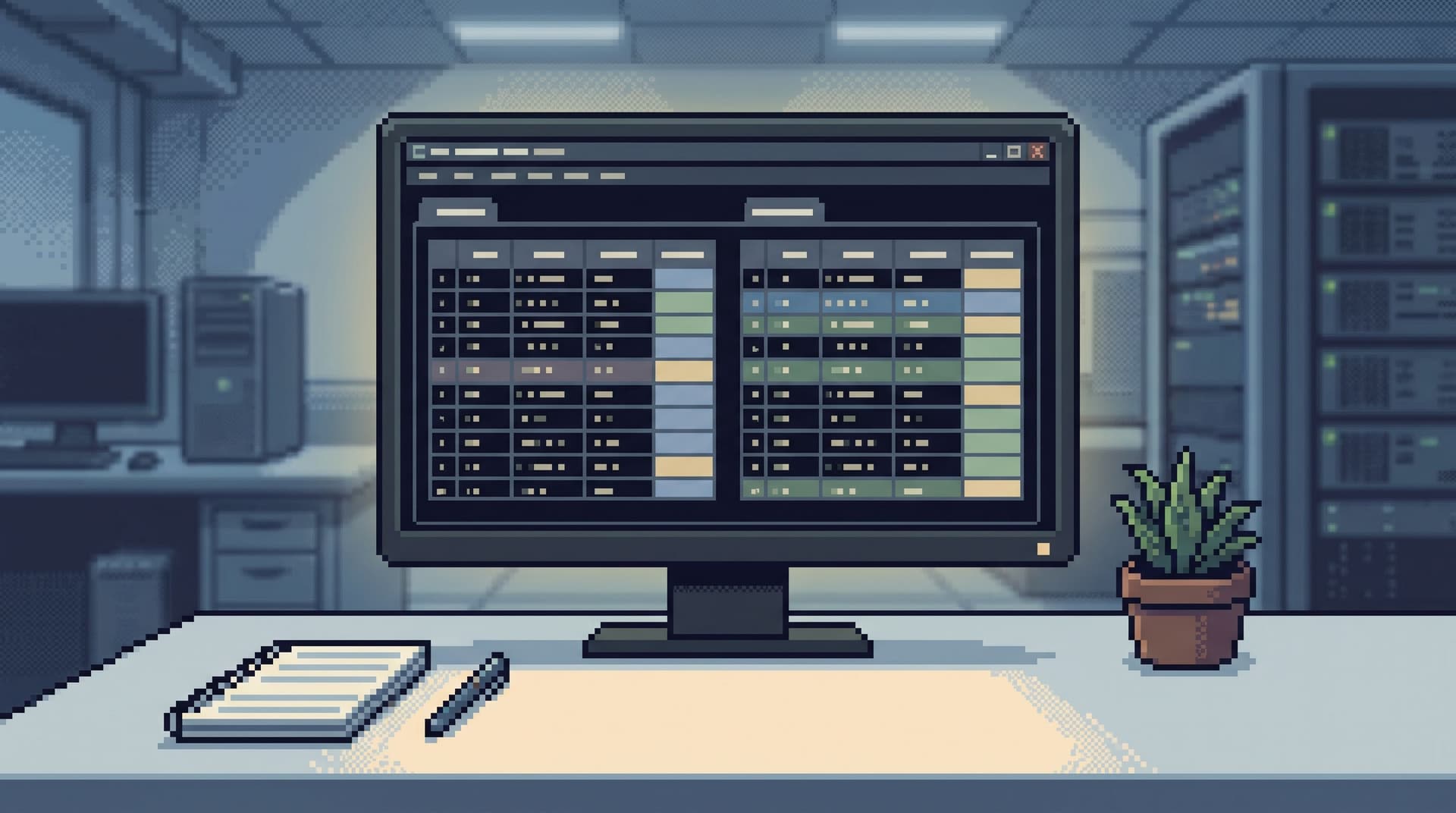
Tools like Simpl exist exactly for this middle layer: an opinionated database browser that gives you a calm, streamlined interface for exploring, querying, and understanding data without the noise of full BI or admin tools.
Why dashboard overload quietly hurts engineering work
Dashboard overload rarely shows up as a single big failure. It shows up as:
- Slow incidents. You jump from an alerting dashboard to a metrics board to a product analytics view, then finally to SQL. Each jump drops context.
- Shallow answers. You stop at “error rate spiked here” instead of following the story into specific users, jobs, or rows.
- Tool roulette. No one is sure whether to start in BI, logs, a console, or a SQL IDE. The loudest tool wins.
- Hidden read work. Real understanding happens in ad‑hoc queries and screenshots in Slack, not in repeatable paths.
If this feels familiar, you might recognize the patterns we covered in:
- Post-Dashboard Debugging: Why Incident Workflows Need Trails, Not Tiles
- The Calm Query Session: Designing Database Work Around One Entry Point, Not Ten
The short version: dashboards are good at telling you that something is wrong. They are not a workflow.
You need something else for the work after the chart turns red.
The three quiet failure modes of BI-first debugging
1. Tiles instead of trails
A dashboard is a wall of tiles. Each tile is:
- A frozen question
- A fixed aggregation
- A static cut of reality
Incidents, on the other hand, are trails:
- This user
- At this time
- Across these services
When you try to follow a trail using tiles, you end up:
- Clicking through unrelated dashboards “just in case”
- Filtering by user ID in places that were never designed for that
- Exporting CSVs to do the real work elsewhere
You’re trying to walk a path using snapshots.
2. Metrics pretending to be facts
BI is optimized for metrics:
- Aggregated
- Sampled
- Often delayed or eventually consistent
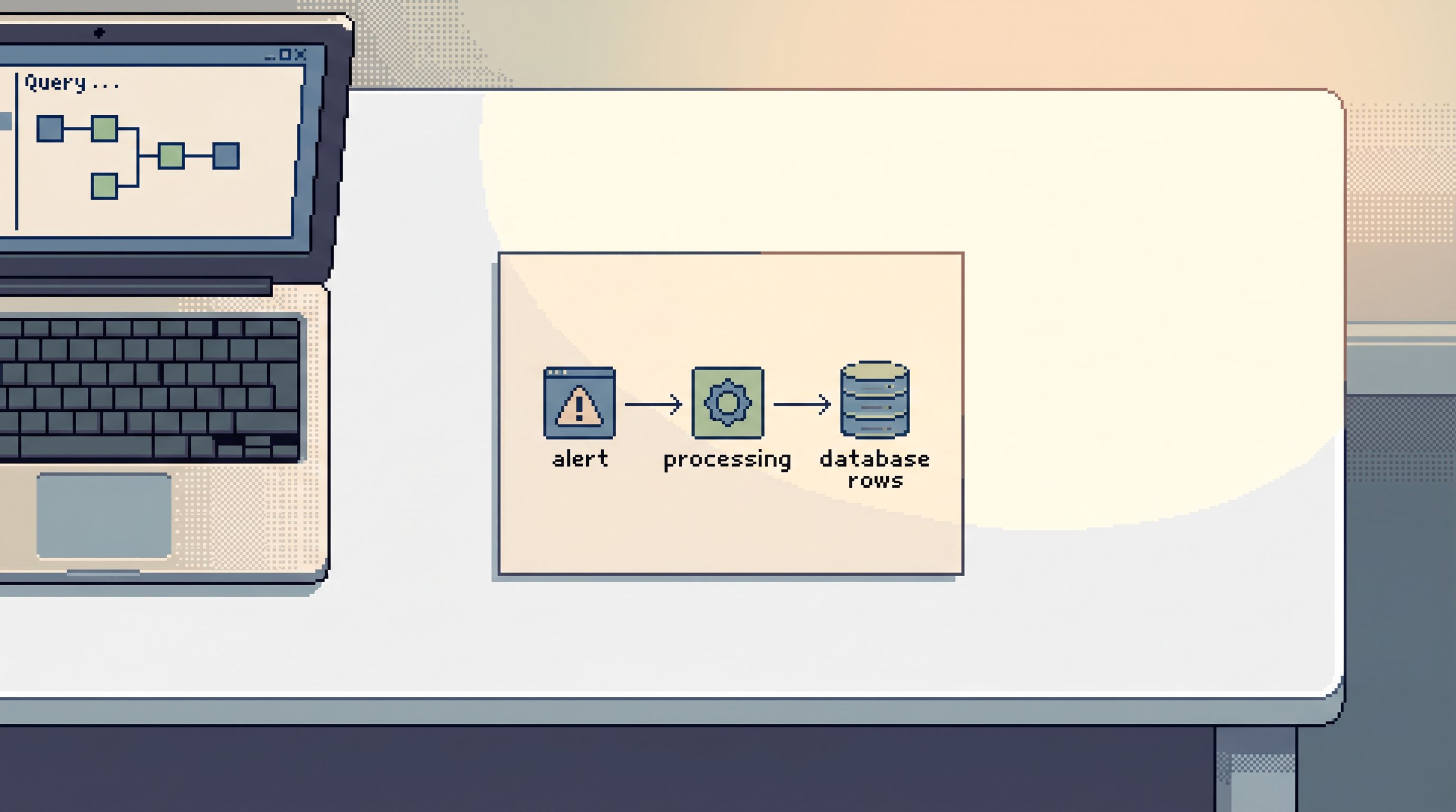
Debugging is optimized for facts:
- Exact rows
- Exact timestamps
- Exact transitions of state
When you stay in BI too long, you get stuck in “vibes”:
- “It looks like more failures around this time.”
- “This segment seems worse than usual.”
Useful for direction. Not enough for a fix.
3. Everyone sharing one giant surface area
Most BI setups are shared across roles:
- Executives
- Product managers
- Analysts
- Engineers
The result is a single, noisy surface:
- Hundreds of dashboards
- Conflicting versions of “the same” report
- Filters and segments tuned for reporting, not debugging
Engineers end up scrolling through other people’s questions, trying to retrofit them to answer their own.
A different stance: focused reads instead of more dashboards
Instead of asking “How do we fix BI?”, ask a different question:
What is the smallest, calmest surface that lets engineers read what’s actually happening in production?
That surface looks less like a BI platform and more like:
- A focused database browser for production and staging
- Opinionated read paths that encode how your team actually investigates
- Calm defaults that keep reads safe, scoped, and repeatable
This is the stance behind tools like Simpl: you don’t need another dashboard. You need a better way to read.
If you want a deeper dive into this idea of small, opinionated read surfaces, see:
Step 1: Separate “metric work” from “read work”
The first move out of dashboard overload is conceptual, not technical:
- Metric work: trends, KPIs, reporting, experiments, long‑range questions.
- Read work: specific users, jobs, rows, and timelines tied to concrete events.
Write this down somewhere visible for your team:
- If the question is about a trend, start in BI.
- If the question is about a specific entity or event, start in a read tool.
Then make the separation real:
-
Name the tools.
- “Looker is for metrics.”
- “Simpl is for production reads.”
- “Grafana is for alerts and time‑series.”
-
Route questions deliberately. When someone asks in Slack:
- “Did this user’s subscription get double‑charged?” → read tool
- “Are we seeing more double‑charges this week?” → BI
-
Stop forcing BI to be an incident console.
- Use it to confirm that something is wrong.
- Switch quickly to a read surface to understand what actually happened.
This single distinction removes a surprising amount of noise.
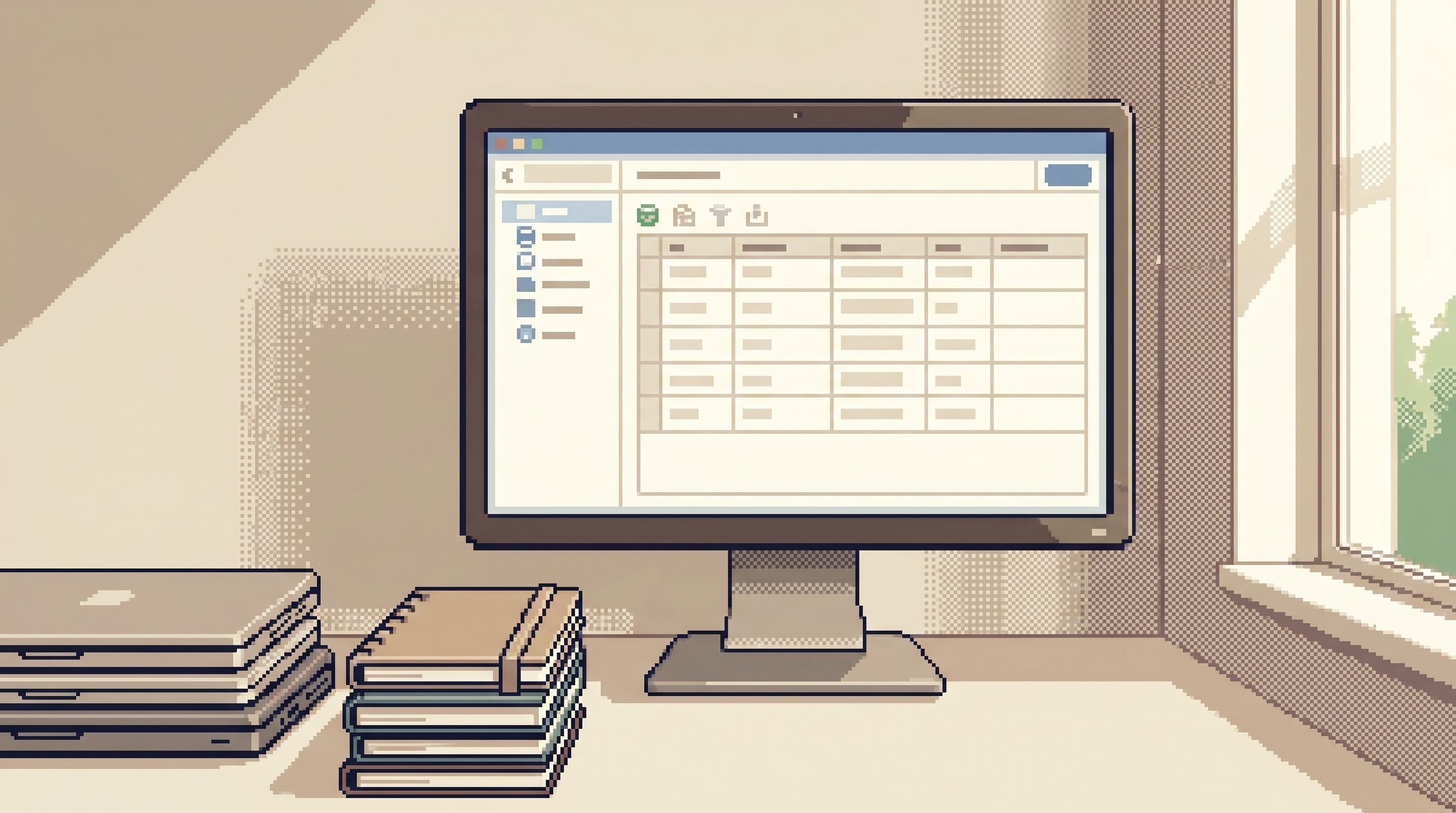
Step 2: Design a calm entry point for reads
Escaping dashboard overload isn’t about adding a new tool. It’s about choosing one clear door into your data.
A calm entry point for read work should:
- Be read‑first and preferably read‑only
- Have opinionated defaults (safe limits, scoped environments)
- Make it easy to follow a single trail instead of opening ten tabs
That’s the design philosophy behind Simpl:
- One interface for staging and production
- Trails of queries you can replay and share
- Guardrails that make “safe enough” the default
If you’re not using Simpl, you can still apply the same shape:
- Pick one SQL client or browser as the default read tool.
- Lock it down to read‑only for most users.
- Document: “This is where production reads start.”
For a deeper view on why one entry point matters, see:
Step 3: Turn recurring dashboard hunts into focused read paths
Most dashboard fatigue comes from the same patterns repeating:
- “Open the payments dashboard, filter by user, click into logs, then ask someone for a SQL query.”
- “Check the feature‑flag panel, then the cohort dashboard, then a warehouse table.”
The questions repeat. The path doesn’t.
Instead, identify your top 5 recurring questions and turn them into opinionated read flows.
Examples:
-
“What happened to this user’s last N orders?”
- Inputs: user ID or email
- Reads:
- Orders table (last N)
- Payments table (matching transactions)
- Events table (key status changes)
-
“Why did this payout get stuck?”
- Inputs: payout ID
- Reads:
- Payouts table (status timeline)
- Jobs table (retries, failures)
- Related ledger entries
-
“What changed between yesterday and now for this tenant?”
- Inputs: tenant ID
- Reads:
- Config table snapshots
- Feature flags
- Recent migrations touching that tenant
In a tool like Simpl, these become:
- Named, parameterized read paths
- One‑click templates that take an ID and walk the same trail every time
- Calm, shareable links instead of screenshots
If you want to go deeper on this idea, you’ll like:
Even without specialized tooling, you can:
- Store these flows as SQL files in your repo
- Wrap them in simple scripts or notebooks
- Standardize on “this is the query we run for X”, not “ask in Slack for the latest version”
Step 4: Shrink what you see to what you actually need
Part of BI fatigue is surface area: too many dashboards, too many tables, too many ways to be distracted.
For engineering read work, you can be much more aggressive about shrinking the world.
Constrain by environment
- Default to staging for exploratory reads.
- Use production for:
- Incident work
- High‑priority tickets
- Data that only exists in prod
A tool like Simpl makes this feel natural: same interface, same flows, just a different environment selector.
Constrain by schema
Most incidents touch a small slice of your data model:
- Users / accounts
- Orders / subscriptions
- Payments / payouts
Give engineers a “puddle” instead of the lake:
- Curated views or schemas for common incident domains
- Hidden or de‑emphasized tables that are irrelevant to day‑to‑day reads
We explored this pattern more in:
Constrain by defaults
Opinionated defaults reduce noise without adding rules:
- Limit queries to recent time windows by default
- Cap result sets to a reasonable number of rows
- Require explicit opt‑in for long‑running or wide‑open reads
The goal isn’t to prevent deep dives. It’s to make “a small, focused read” the path of least resistance.
Step 5: Replace dashboard hopping with linear sessions
Dashboard overload is often session overload in disguise:
- Ten tabs
- Four tools
- No single place that tells the story of what you just did
A calmer pattern is a linear read session:
- One entry point
- One trail of queries and results
- One link you can share afterward
This is where a focused browser like Simpl shines:
- Each session becomes a trail you can replay
- You can attach a session to a ticket or incident doc
- Future you (or a teammate) can follow the same path instead of re‑inventing it
We’ve written about this pattern in detail in:
If you don’t have tooling support yet, you can approximate it:
- Keep a simple markdown log during an incident:
- “Q1: Look up user by ID → result summary”
- “Q2: Join orders + payments → result summary”
- Paste final queries and notes into the ticket
- Treat that log as the seed for a future opinionated read path
Step 6: Align access with real read work
One source of BI dependence is access: dashboards are often the only “safe” place non‑engineers can see production data.
The result:
- Support teams over‑rely on dashboards for questions about specific users
- Product managers can’t follow a trail without pulling in an engineer
- Engineers become gatekeepers for simple reads
A calmer model is to align access with real read work, not job titles:
- Define the concrete questions different roles need to answer
- Give them a focused, read‑only surface to answer those questions
- Use opinionated paths and guardrails instead of blanket restrictions
This is the idea behind the Calm Access Model, which we explored in:
With a tool like Simpl, this looks like:
- Support: safe, parameterized paths for “look up user by ID”, “inspect last N orders”
- Product: curated reads for feature flags, cohorts, and experiment details
- Engineering: full trail‑building capabilities with clear guardrails
The more people can answer their own focused questions, the less everyone has to fight the BI surface.
What you gain when you move beyond BI fatigue
When you invest in focused reads, a few things change quietly but permanently:
- Incidents feel smaller. You move quickly from “a red chart” to “this specific story about this user or job.”
- Sessions become assets. The path you walk once becomes a reusable trail, not a pile of screenshots.
- Dashboards can do their real job. They go back to being early‑warning systems and reporting tools, not overloaded incident consoles.
- New teammates ramp faster. Instead of teaching them “the dashboards,” you teach them a handful of read paths and a single entry point.
Most importantly: reading production data starts to feel calm again. Less scavenger hunt, more clear narrative.
Summary
Dashboard overload isn’t about too many charts. It’s about using the wrong tool for the wrong kind of work.
To move from BI fatigue to focused reads:
- Separate metric work from read work. Use BI for trends, a focused browser for specific stories.
- Choose one calm entry point for reads. Prefer read‑only, opinionated tools like Simpl.
- Encode recurring questions as read paths. Stop re‑discovering the same flows every incident.
- Shrink the visible surface. Constrain by environment, schema, and defaults.
- Structure work as linear sessions, not tab piles. Turn trails into assets you can replay and share.
- Align access with real read work. Give each role the focused reads they actually need.
Do this, and dashboards can go back to what they’re good at: telling you that something is wrong, then getting out of the way while you follow the data.
Take the first step
You don’t have to redesign your entire stack to escape dashboard overload.
Start small:
- Pick one recurring question you currently answer with a BI tool.
- Move that question into a focused read surface—Simpl, a read‑only SQL client, or a small internal tool.
- Turn the path you walk into a named, reusable read flow.
Run that experiment for a week. Notice how incidents feel. Notice how often you still need the dashboard.
If you want a calmer way to read production data without adding another wall of tiles, try building that first focused read flow in Simpl. One question. One trail. No overload.