When Read-Only Isn’t Enough: Subtle UX Traps That Still Make Production Data Feel Dangerous

Most teams eventually do the “right” thing and lock production behind read-only tools.
The surprise is what happens next: production still feels dangerous.
People hesitate before running queries. Screenshots get passed around instead of links. Debugging sessions stay on Zoom because “I don’t want to be the one to click the wrong thing.”
The problem isn’t just writes. It’s how the interface behaves around production data.
Read-only is a permission setting. Safety is a user experience.
This post looks at the subtle UX traps that keep production feeling risky even when writes are blocked—and how to design calmer, more trustworthy read paths instead.
Along the way, we’ll reference how tools like Simpl approach these problems on purpose: as a focused, opinionated database browser for teams who want to explore production without feeling like they’re defusing a bomb.
Why "read-only" doesn’t automatically feel safe
When teams say “we made production read-only,” they usually mean:
- Roles without
INSERT/UPDATE/DELETE - No schema changes
- Maybe a query timeout or row limit
That’s necessary. It’s not sufficient.
Engineers still worry about:
- Accidentally running an expensive query that slows production
- Misreading data because of time zones, soft-deletes, or partial joins
- Leaking sensitive data in screenshots and Slack threads
- Losing their place in a messy client and re-running the wrong query
These are UX problems, not permission problems.
If your interface makes every action feel ambiguous, overloaded, or reversible only “if you know what you’re doing,” people will treat production like a live grenade—even when the database role is technically safe.
Read-only is table stakes. The real work is making reads feel:
- Predictable – the tool behaves the same way every time
- Scoped – you can tell what you’re about to touch
- Narrative – you can see how you got here and what happened before
- Shareable – you can safely show others what you saw, without copy‑pasting raw rows everywhere
The subtle UX traps that keep production scary
Here are the patterns that quietly undermine safety, even in read-only tools.
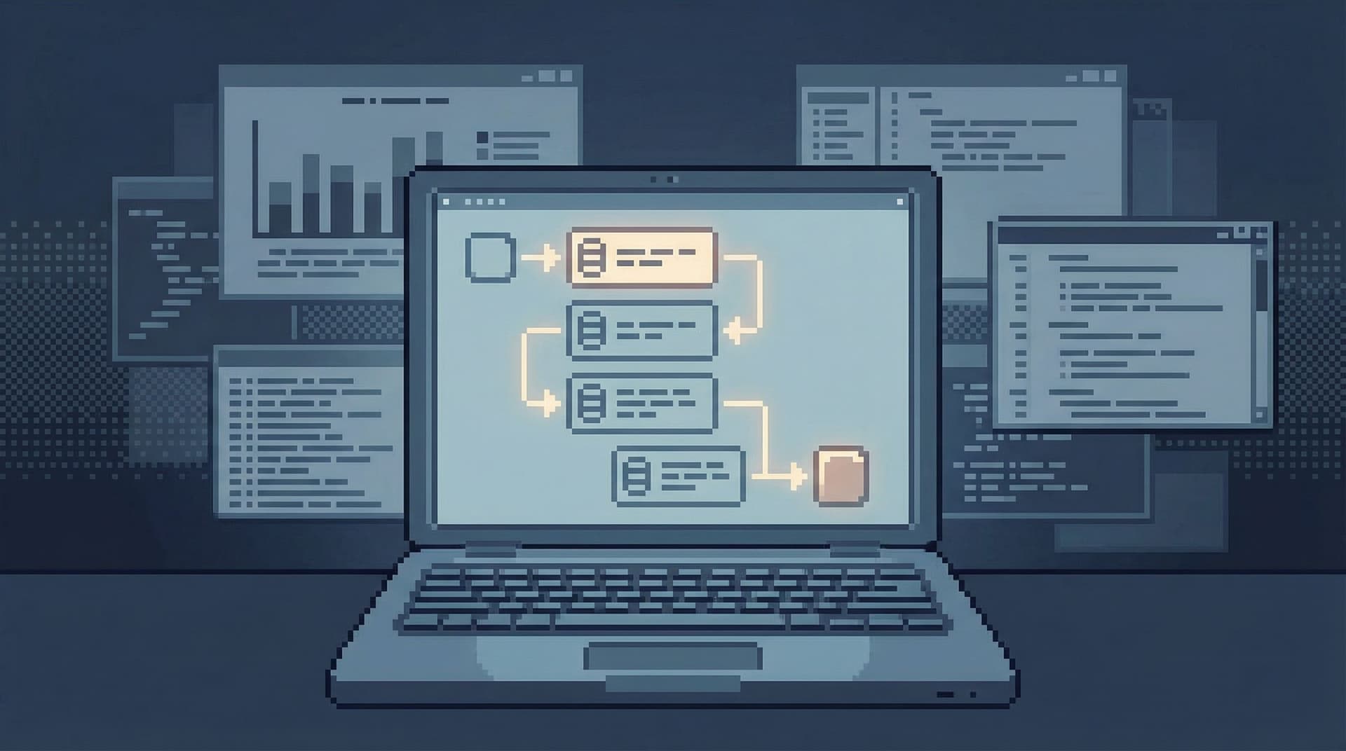
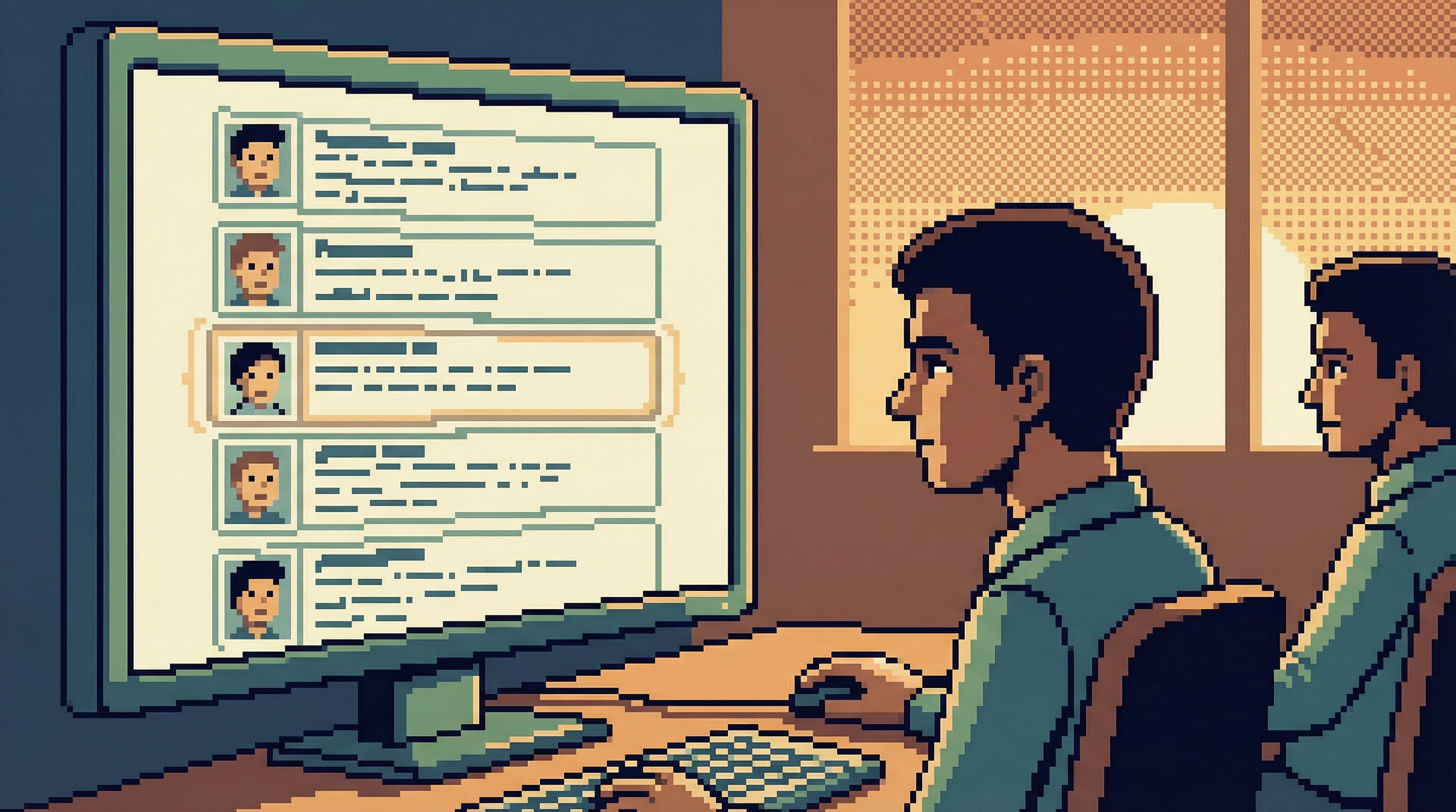
1. The blank, omnipotent query editor
Most database clients open to the same screen:
- A blank SQL editor
- A schema tree
- A big Run button
It looks neutral. It isn’t.
A blank editor sends one message: type anything, anywhere, any time. Even if the role is read-only, the feeling is still “I could ask the database to do something huge by accident.”
The UX trap:
- No clear separation between quick inspections and heavy analysis
- No visual difference between a 10-row lookup and a cross-join over a billion rows
- No hint of “this is the kind of query this space is for”
Safer alternatives:
- Start in scoped views: user detail, job detail, incident context
- Treat free-form SQL as an advanced lane, not the default
- Make heavy queries feel visually distinct and slower to run
This is closely related to the argument in Designing for Read-Heavy Work: Why Most Database Sessions Should Never Start With ‘WRITE’ — the first screen sets the mental model for the whole session.
2. Overloaded primary buttons
A single big button labeled Run, Execute, or Apply that:
- Runs arbitrary SQL
- Re-runs the last query
- Sometimes also paginates or refines
…is a subtle hazard.
The problem isn’t what it can do. It’s that the UI doesn’t clearly signal what it’s about to do.
Common failure modes:
- You think you’re re-running a small filtered query; instead you’ve cleared the filter and are now scanning a huge table.
- You’re trying to step through a read trail; the button silently edits the query text behind the scenes.
Safer patterns:
- Separate buttons for:
- Run current query
- Re-run last query
- Step to next page / next event / next job
- Inline labels that change with context:
Run 10-row preview,Run count only,Run full query (may be slow) - No hidden query mutations: if the tool rewrites your SQL, it should be visible and explainable.
Tools like Simpl lean toward explicit, context-aware actions instead of one magic button that does whatever the tool designer felt was convenient.
3. Infinite canvas, no clear trail
Tabs, side panels, overlays, saved query drawers—most database tools assume more surface area equals more power.
The side effect:
- Queries pile up in background tabs
- You lose track of which tab is “the real one”
- It’s easy to re-run an old query in the wrong context
This isn’t just an attention problem; it’s a safety problem. When you can’t see the path you took, you can’t easily:
- Reproduce what you did during an incident
- Explain a decision based on specific rows
- Spot the moment you changed a filter or join
A quieter alternative is the single-window session: one visible trail, one active context. We go deeper on this in The Single-Window Database Session: Structuring Deep Work Without Tabs, Panels, or Overlays.
Key ideas:
- Treat a session as a story, not a pile of tabs
- Show a linear history of reads, not just a query log
- Let people annotate or label steps: “user lookup”, “job trace”, “billing detail”
4. Ambiguous scope and environment
Engineers fear production most when they’re not 100% sure where they are.
UX smells:
- Tiny environment labels in a corner
- Color-coding that’s inconsistent across tools
- Connection dropdowns that silently switch when a tab is duplicated
Even in read-only contexts, this causes:
- Hesitation: “Wait, is this staging or prod? Am I looking at the right user?”
- Misleading answers: “Looks fine in my client” (it was staging all along)
Safer patterns:
- Loud environment framing:
- Clear banner:
Production · us-east-1 - Distinct, consistent color scheme
- Repeated in the URL, window title, and session header
- Clear banner:
- No silent environment switches:
- Changing environments should feel like a mode change, not a dropdown tweak
- Consider requiring a brief confirmation when connecting to production
- Per-environment affordances:
- Fewer knobs and levers in prod
- More in staging and local
5. Results that look the same, even when meaningfully different
When every result grid looks identical, it’s easy to forget that:
- Some columns are PII
- Some rows are soft-deleted
- Some timestamps are in a different time zone
- Some values are derived or cached, not source of truth
The UX trap is a flat, neutral table that treats every cell as equal.
Safer patterns:
- Visual distinctions for sensitive data:
- Masked by default with a reveal affordance
- Clear icons or tags for PII columns
- Explicit status for “weird” rows:
- Badges for soft-deleted, archived, or migrated records
- Inline hints: “This row is from legacy system X”
- Time clarity:
- Show time zone with every timestamp, not just in a tooltip
- Offer a consistent “application time” view
A calm database browser like Simpl is opinionated here: it’s better to slightly over-annotate than to let people quietly misread production.
6. No guardrails around expensive reads
Read-only does not mean cost-free.
Teams still worry about:
- Accidental full-table scans
- Cartesian joins
- Unbounded history queries during incidents
Most tools surface this only after the fact: a query took 90 seconds, everyone felt nervous, and now people are afraid to run anything similar.
Safer patterns:
- Soft limits with clear UI:
- Default row and time limits with visible controls, not hidden config
- Phrasing like:
Showing first 500 rows · Increase limitinstead of silently truncating
- Pre-flight warnings:
- “This query will scan ~12M rows. Proceed?”
- “No WHERE clause detected on large table
events.”
- Different lanes for different work:
- A “quick inspect” mode that always limits scope
- A “heavy analysis” mode that’s slower and more explicit
7. Context lost between people
A lot of perceived danger comes from social friction, not database mechanics.
Common pattern:
- Engineer A runs a careful series of read-only queries in a GUI.
- They paste screenshots into Slack to share results.
- Engineer B can’t easily reproduce the path.
- During an incident, someone re-runs “something like that query” and gets different results.
The UX trap is tools that treat queries as ephemeral and personal.
Safer patterns:
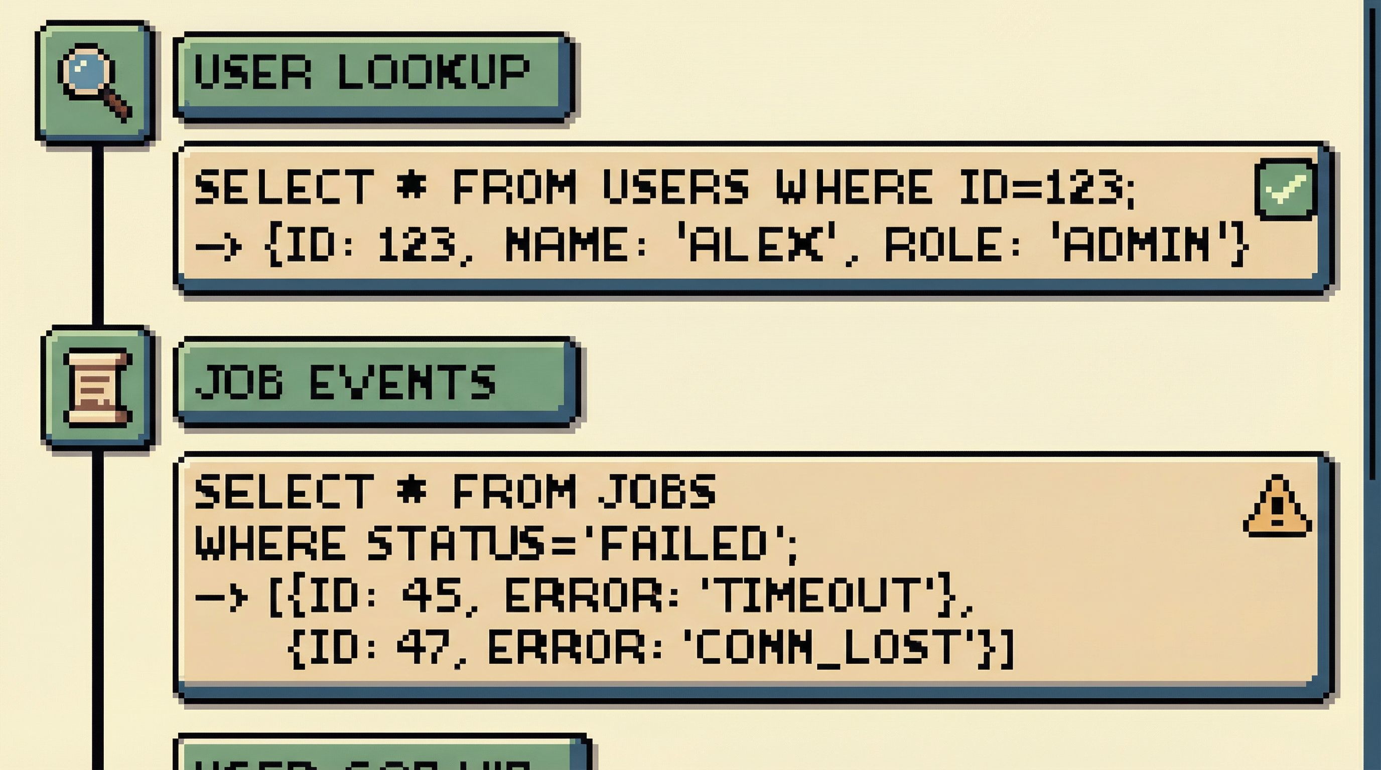
- Shareable, reproducible read trails:
- A link that shows exactly what was run, in what order
- Stable URLs for “this user’s story” or “this job’s history”
- Lightweight annotations:
- Notes on why a filter was added
- Labels like “suspected cause” or “ruled out”
- Async-friendly workflows:
- Designed so you can send a link instead of scheduling a meeting
We dig into this further in Read Trails, Not Logs: Turning Database Sessions into Shareable Narratives.
Designing calmer production reads
If you own or influence your team’s database tools, you can start moving beyond “read-only” toward “feels safe.”
Here are concrete design moves that help.
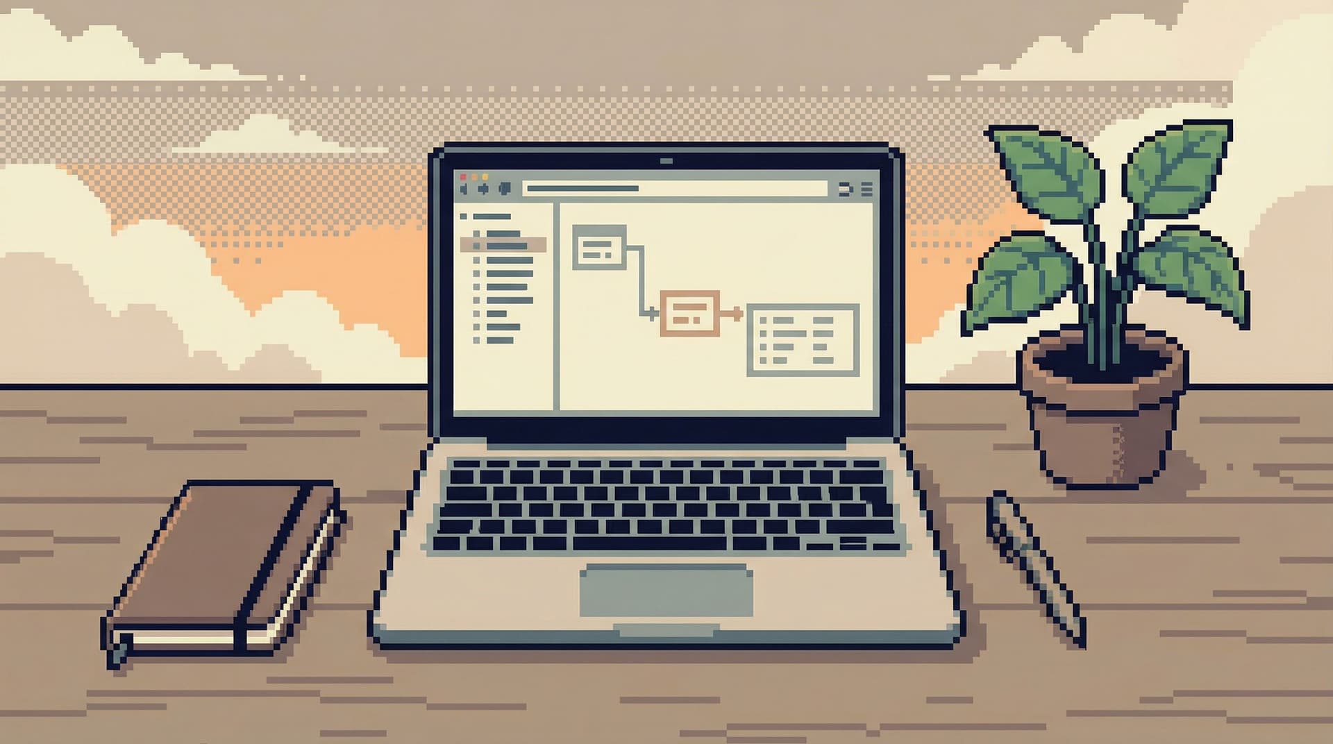
1. Make the default view a story, not a text box
Instead of a blank editor, open to:
- A search bar for primary entities (user, job, order)
- A recent stories list: last users or incidents you inspected
- A linear trail of the current session’s steps
Reserve the raw SQL editor for when people explicitly opt in.
2. Narrow the query surface
Borrow the idea of the narrow query surface from opinionated tools:
- Fewer places to type arbitrary SQL
- More structured, guided views for common tasks
- Clear separation between:
- “I’m just looking at a user”
- “I’m running a one-off analysis”
This reduces the cognitive load and makes each action more legible. For a deeper dive into this philosophy, see The Narrow Query Surface: Designing Database Tools That Encourage Only the Right Questions.
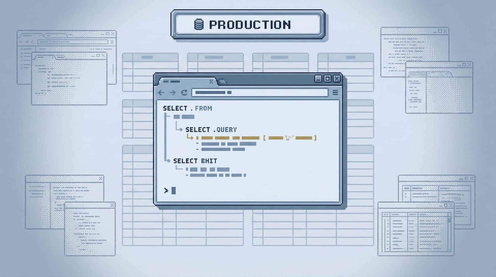
3. Encode environment and scope into the frame
Don’t hide the most important context:
- Put environment in the title, header, and URL
- Show scope breadcrumbs:
Production → Users → user_123 → Payments - Make it obvious when you’re:
- On a single entity
- On a filtered subset
- On a raw table
4. Build in “safe by friction” patterns
Some actions should feel slightly slower and heavier, even in read-only contexts:
- Removing a filter on a large table
- Expanding a time range from 24 hours to 30 days
- Switching from a user-scoped view to a table-wide view
Design ideas:
- Add a micro-confirmation when crossing a threshold: “This will widen your query from 1K to 5M rows.”
- Use progressive disclosure: advanced options behind a clearly labeled affordance, not sprinkled everywhere.
5. Treat every session as something you might share later
Even if your tool doesn’t yet support full read trails, you can design with that future in mind:
- Keep a visible session history in the UI
- Make queries and filters copyable as URLs or JSON snippets
- Encourage engineers to name important queries, not just save them anonymously
When you eventually adopt (or build) a tool like Simpl, this mindset will make the transition natural: you’re already thinking in terms of reproducible stories, not one-off pokes at the database.
6. Align with how people actually debug
Most production work looks like:
- Start with a concrete question: “What happened to this user?”
- Follow a narrow path across a few tables.
- Stop once the story is clear.
Your database UX should reinforce that linearity:
- One active question at a time
- One primary path visible, with side quests parked instead of opened in new tabs
- Clear start and end for each session
This echoes the one-query mindset from The One-Query Mindset: Structuring Database Work to Avoid Cognitive Thrash: fewer parallel threads, more focused depth.
How to start, without rebuilding your whole stack
You don’t need to rewrite your tools from scratch to make production feel calmer. You can start with a few deliberate changes.
If you’re a team lead or staff engineer:
- Standardize on a calmer prod client.
- Pick one primary tool for production reads.
- Prefer tools that are opinionated about scope and environment, not just powerful.
- Define explicit “read lanes.”
- For incidents, for user debugging, for migrations.
- Document which tool, which environment, and which patterns to use.
- Normalize sharing trails, not screenshots.
- Even if it’s just pasting SQL plus a short explanation.
If you’re a tool builder or platform engineer:
- Audit your primary buttons.
- For each, ask: “Can a user tell exactly what this will do next?”
- Make environment framing louder.
- You can ship this in a day. It will pay off for years.
- Introduce soft limits and pre-flight hints.
- Start with row limits and WHERE-clause checks on large tables.
If you’re an individual engineer:
- Adopt your own single-window rule.
- One main window for production reads; no tab explosions.
- Be explicit with yourself.
- Write down the question you’re answering before you start querying.
- Leave traces for future you.
- Save useful queries with names.
- Paste short narratives into tickets or docs, not just raw results.
Summary
Read-only permissions are necessary, but they’re not the finish line.
Production data feels dangerous when the interface around it is:
- Ambiguous about scope and environment
- Overloaded with omnipotent buttons and infinite canvases
- Flat and neutral where it should be annotated and opinionated
- Ephemeral where it should leave a clear, shareable trail
A calmer approach to database UX:
- Starts from stories, not blank editors
- Narrows the query surface to the questions that matter
- Makes environment and scope loud and consistent
- Builds in soft friction around expensive or wide queries
- Treats every session as a potentially shared narrative, not a private experiment
When you design for this, production stops feeling like a minefield and starts feeling like what it actually is: the most accurate story of how your system behaves.
Take the first step
If production still feels risky on your team—even with read-only roles—pick one small change and ship it this week:
- Make the production environment framing unmistakable.
- Add a default row limit and show it prominently in the UI.
- Run your next debugging session in a single window, with a visible trail of queries.
Then, when you’re ready to go further, try a tool that’s built around these ideas from the start. A calm, opinionated database browser like Simpl is designed to make production reads feel safe, linear, and shareable—without burying you in knobs or pretending your database is just another IDE target.
You don’t need more power over production. You need fewer ways to feel unsure about what will happen next.
Start there.