Guardrails in the Query Editor: UX Patterns That Make Unsafe Reads Hard by Default

Most engineers don’t blow up production with a DROP TABLE.
They hurt it with a “harmless” read.
A wide SELECT on the hottest table during traffic spikes.
A missing limit on a slow join.
A copy‑pasted query from staging that behaves very differently on real data.
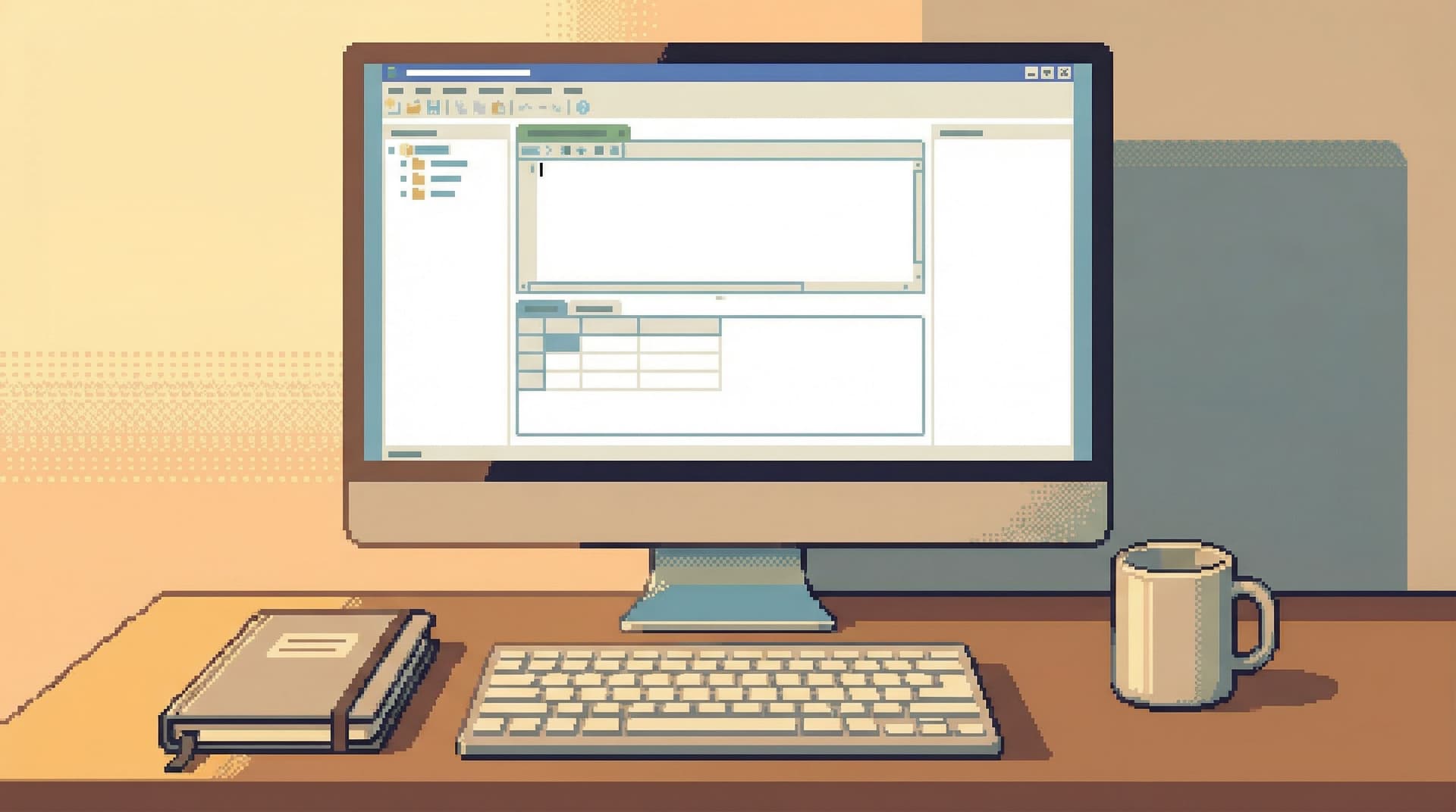
The problem isn’t intent. It’s that most query editors make every read feel the same. A SELECT * FROM events against a billion‑row table looks as safe as a single‑row lookup. The interface is neutral. The database is not.
Guardrails in the query editor are about changing that default. Not with more policy docs or Slack warnings, but with UX patterns that make unsafe reads hard by default—and safe reads feel natural.
Tools like Simpl are built around this stance: calm, opinionated database browsing where the easiest path is almost always the safest one.
Why Unsafe Reads Are a UX Problem, Not Just a Query Problem
When a read goes wrong in production, it usually looks like one of these:
- A full‑table scan on a large table during peak traffic
- A multi‑table join that explodes in cardinality
- An unbounded query that quietly runs for minutes, tying up connections
- A “debug” query run repeatedly because the answer is unclear the first time
Those aren’t rare edge cases; they’re the natural outcome of three common UI choices:
-
Blank, unopinionated editors.
- No hints about limits, filters, or cost.
- No distinction between “quick lookup” and “deep exploration.”
-
Flat visual hierarchy.
- A single text area where
SELECT,UPDATE, andDELETEall look the same. - No visual cues for queries that are large, expensive, or cross‑environment.
- A single text area where
-
No feedback loop.
- You run a query, see a grid, and move on.
- Nothing helps you notice that you just scanned 30M rows to answer a yes/no question.
We wrote about this more broadly in When Read-Only Isn’t Enough: Subtle UX Traps That Still Make Production Data Feel Dangerous. Guardrails are the concrete answer: design the query surface so that unsafe reads are possible, but never casual.
Principle: Safe Reads Should Be the Path of Least Resistance
Good guardrails don’t feel like friction. They feel like the natural way to work.
A calm query editor should:
- Nudge you toward narrow questions. Single users, small time windows, specific IDs.
- Make unbounded or vague queries visually and interaction‑wise “heavier.”
- Expose cost before commitment. Let people see what they’re asking the database to do.
This is the same stance behind the narrow, focused consoles we explored in The Calm Query Console: Why Most Database Work Needs Fewer Modes, Not More Features. Guardrails are how that philosophy shows up directly in the editor.
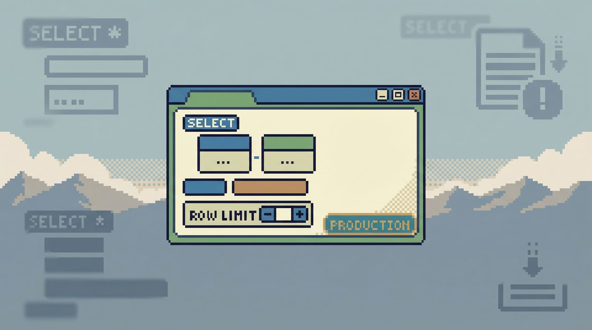
Pattern 1: Limits as a First-Class, Sticky Default
The simplest guardrail: every query has a limit by default.
Not buried in a settings menu. Not something you set once per connection. It’s a visible, first‑class part of the editor.
What this looks like in practice
- A small, always‑visible control next to the editor:
Limit: 200. - The limit applies even if the user forgets to add
LIMITin SQL. - Increasing the limit requires a deliberate action (click, keyboard shortcut, or explicit override).
Opinionated details that matter
- Conservative defaults per environment.
- Production:
LIMIT 100–500. - Staging / dev: higher, but still bounded.
- Production:
- Per‑table overrides for known heavy tables.
- e.g.,
events,logs,pageviewsdefault toLIMIT 50.
- e.g.,
- Persistent, but scoped.
- If a user temporarily raises the limit, it applies to that session or that query, not globally forever.
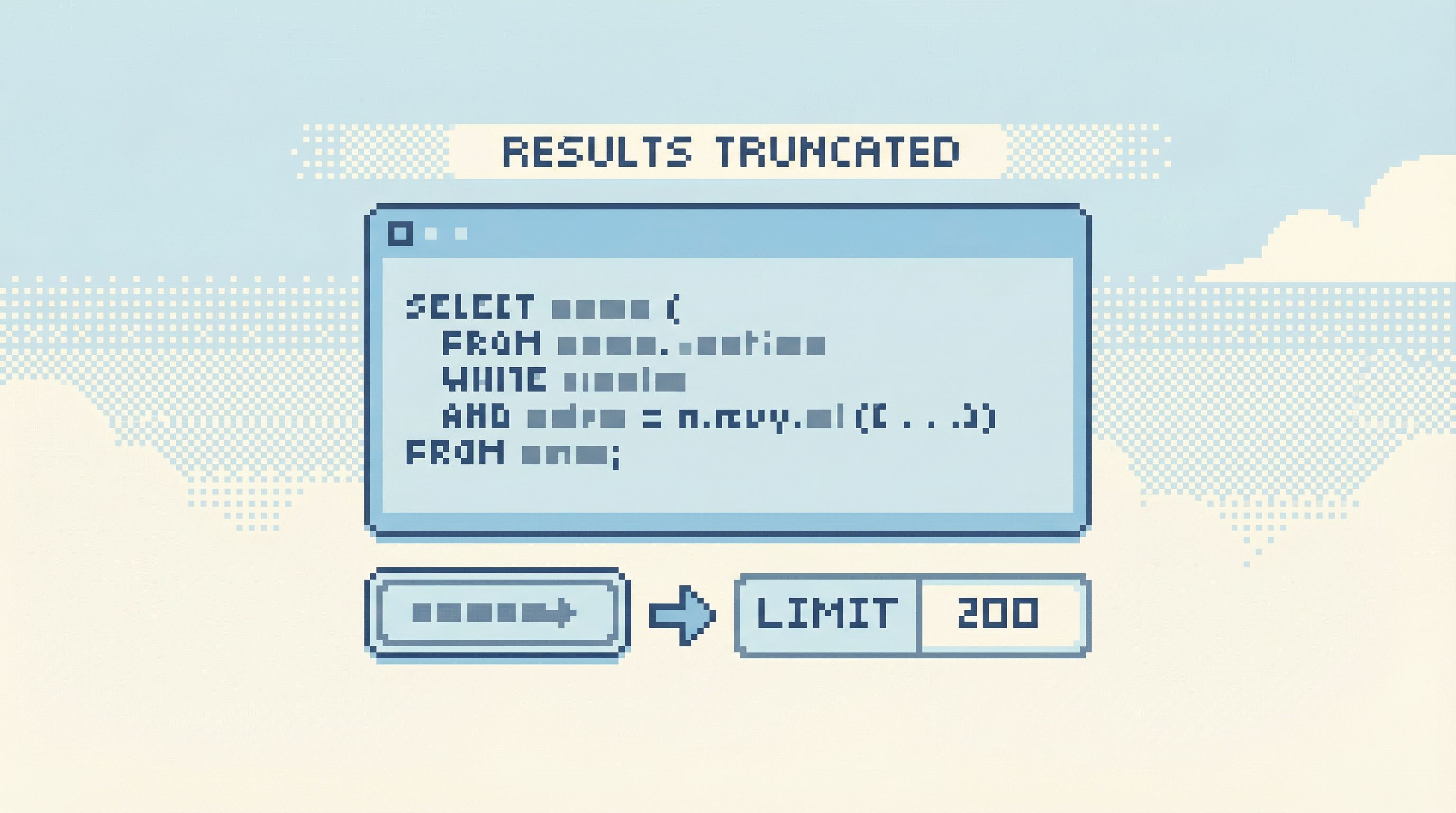
UX behaviors that help:
- When the limit is hit, show a clear banner: “Showing 200 of many results. Narrow your query or raise the limit.”
- Offer one‑click refinements instead of just “run again bigger.” For example:
- “Filter by user_id”
- “Restrict to last 24h”
Tools like Simpl treat limits this way: not an advanced option, but part of the basic shape of every read.
Pattern 2: Guarded Entry Points for Heavy Tables
Not all tables are equal. Some are:
- Very large (events, logs, metrics)
- Operationally sensitive (billing, auth, payments)
- Performance‑critical (queues, hot paths)
Yet most tools let you open them exactly the same way as a tiny lookup table.
A calmer stance: make “just open this table” impossible for certain surfaces.
Instead of:
- Clicking
eventsand immediately seeingSELECT * FROM events LIMIT 1000.
Do this:
-
Require a filter before first read.
- Show a small form:
user_id,time window,event_type. - Generate the query from that, with a strict limit.
- Show a small form:
-
Offer opinionated presets.
- “Recent events for a single user”
- “Events for a job run ID”
- “Last 10 minutes for a specific event_type”
-
Hide raw
SELECT *behind an explicit action.- e.g., a secondary button: “Open table directly (slower, advanced).”
This is the same idea as the Anti‑Explorer stance in The Anti-Explorer View: Why Less Navigating Makes Production Databases Feel Safer: less wandering, more guided entry.
Why this works
- It forces a question before a query.
- It makes the most common safe use cases (user debugging, job tracing) one click away.
- It makes unbounded “let’s just look” behavior feel unusual and slightly heavier.
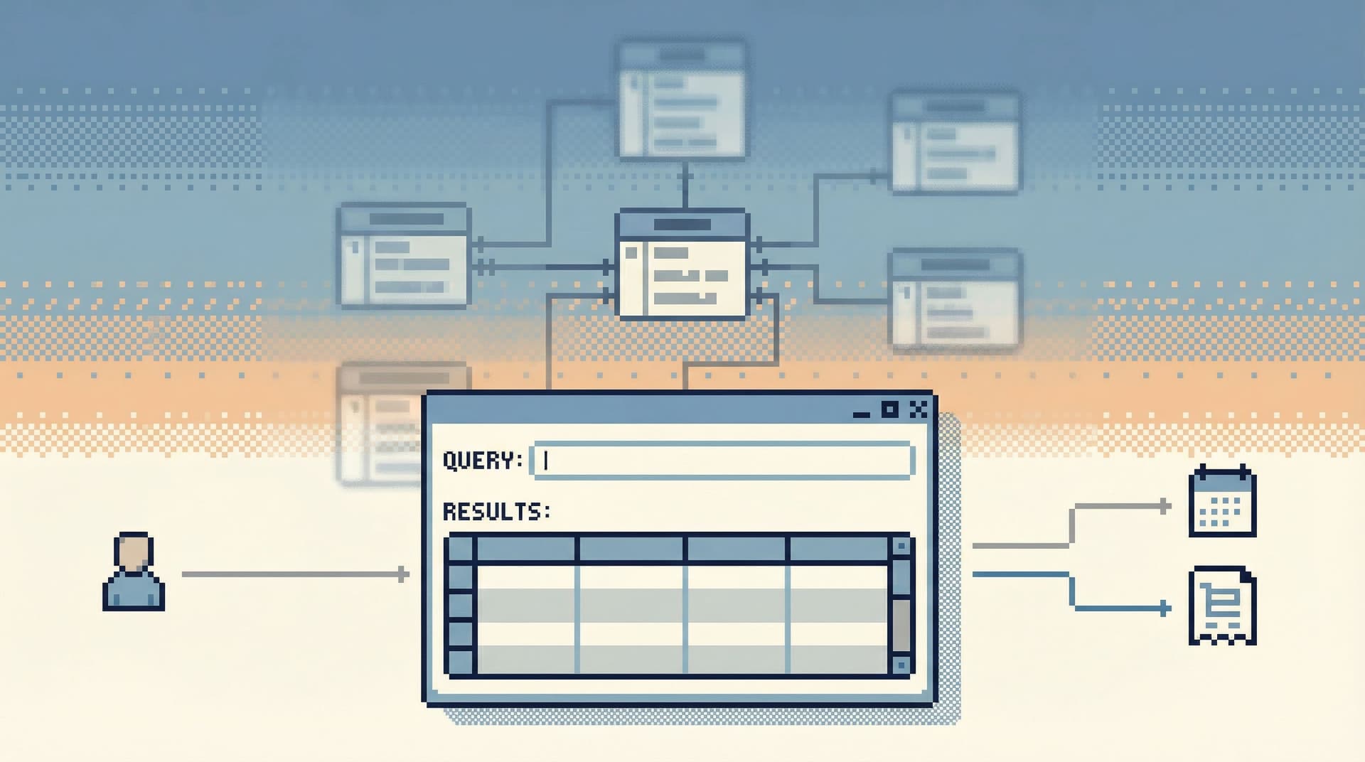
Pattern 3: Cost‑Aware Feedback Before and After Execution
Most query editors only give you feedback after you’ve already done the damage.
A better pattern: low‑friction hints about cost before you run, and clear telemetry after.
You don’t need a full query planner UI. You need just enough signal to make people pause.
Before execution
-
Heuristics on obvious risk patterns:
- Full‑table scan on known large tables with no
WHERE. - Joins without predicates on high‑cardinality columns.
- Wide
SELECT *on tables with many large text/blob columns.
- Full‑table scan on known large tables with no
-
Soft warnings, not hard blocks:
- A subtle banner: “This query may scan a large table without filters. Consider adding a WHERE clause or limit.”
- A small icon next to the Run button that changes state: green (narrow), yellow (potentially heavy), red (clearly unbounded).
After execution
- Show rows scanned, rows returned, and execution time in a simple summary bar.
- Highlight outliers: e.g., “Scanned 5,200,000 rows to return 32.”
- Offer one‑click refinements: “Add filter on
created_at” or “Add filter onuser_id”.
This is less about teaching query plans and more about building intuition: small questions should not require huge scans.
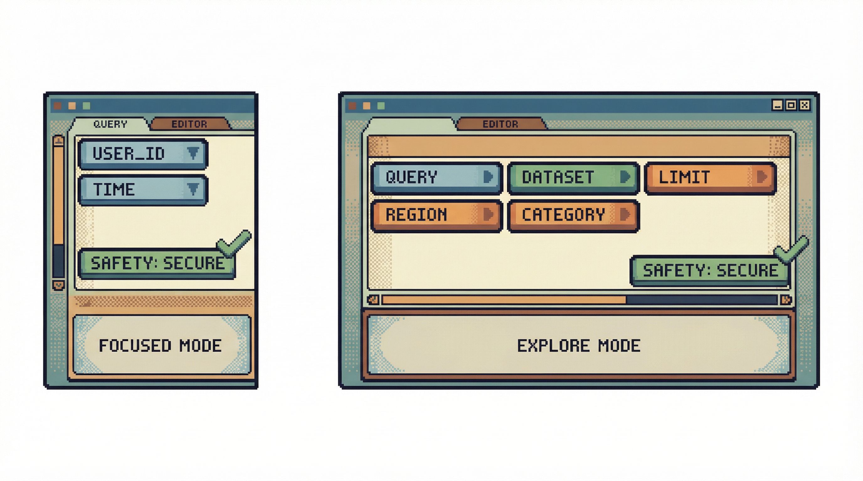
Pattern 4: Structured Modes for Reads (Without Turning into a BI Tool)
Guardrails don’t mean you can never explore. They mean the tool understands what kind of work you’re doing.
A calm query editor can offer two structured modes without becoming a full BI surface:
-
Focused lookup mode
- Designed for: debugging a user, tracing a job, checking a single order.
- Characteristics:
- Strong defaults:
LIMIT 50or less. - Pre‑built filters for IDs and time ranges.
- Minimal layout: query, results, and a small context panel.
- Strong defaults:
-
Exploratory read mode
- Designed for: understanding a new schema area, exploring relationships.
- Characteristics:
- Slightly higher limits, but still bounded.
- More flexible query area, maybe a bit more schema help.
- Stronger cost warnings and more obvious environment labels.
The key is that both modes are read‑only and guarded, but they express different intents. You’re not mixing “incident debugging” with “ad‑hoc analytics” in the same mental space.
We go deeper on this separation in From BI Sprawl to Focused Reads: Separating Exploration from Reporting in Your Data Stack. Guardrails in the editor are how that separation feels at the keystroke level.
Pattern 5: Environment and Context as Loud, Persistent Signals
Many unsafe reads aren’t dangerous because of the SQL itself. They’re dangerous because they’re run in the wrong place.
Common examples:
- Copying a heavy debug query from staging to production without adjusting limits.
- Running a “once a day” backfill‑style read repeatedly during an incident.
Guardrails here are about context clarity, not syntax.
Concrete UX moves
-
Aggressively visible environment labels.
- Color, text, and layout all reinforce: “You are in PRODUCTION.”
- The Run button itself changes appearance by environment.
-
Environment‑aware defaults.
- Lower limits, stricter warnings, and more required filters in production.
- Slightly looser defaults in staging or local.
-
Copy‑paste with adaptation.
- When a query is pasted from another environment, the editor can:
- Reset limits to the safer production default.
- Prompt: “This query came from staging. Want to keep the same table filters?”
- When a query is pasted from another environment, the editor can:
Simpl leans heavily on this: the same SQL in two environments should feel different in your hands, even before you hit Run.
Pattern 6: Linear, One‑Query‑at‑a‑Time Workflows
A subtle source of unsafe reads is cognitive thrash.
You start with a narrow question, then:
- Open three tabs.
- Keep two half‑finished queries around “just in case.”
- Lose track of which one is the safe, narrow one and which is the wide, experimental one.
By the time you hit Run, you’re not fully sure what you’re executing.
A calmer alternative is the one‑query mindset we described in The One-Query Mindset: Structuring Database Work to Avoid Cognitive Thrash:
- One visible active query at a time.
- Clear history and read trail behind it.
- Easy way to “park” experiments without leaving them half‑armed in the editor.
Guardrails that support this:
-
Single active editor window.
- No tab explosions; you move linearly from one query to the next.
-
Named steps instead of raw tabs.
- “Step 1: Find user by email.”
- “Step 2: Load recent orders.”
- Each step has its own query, its own limits, and its own results.
-
Explicit transitions.
- To branch off into a heavier or broader query, you create a new step with its own guardrails, not just modify the existing one.
This doesn’t just make you feel calmer. It reduces the chance that a “test” query accidentally becomes the one you run on production.
Pattern 7: Guardrails as Defaults, Not Walls
The point of all these patterns is not to infantilize engineers. It’s to make the safe path the easy path—and the unsafe path the deliberate one.
Good guardrails share a few traits:
-
Overridable with intent.
- You can raise limits, remove filters, or run heavy reads.
- But you do it through clear, explicit actions with visible consequences.
-
Explained in the interface.
- Warnings say why, not just “No.”
- Defaults are visible, not hidden in configuration.
-
Consistent across the tool.
- The way limits behave in one view matches every other view.
- Environment colors and labels are the same everywhere.
This is the same philosophy we outlined in Guardrails as UX, Not Policy: Turning Risky Database Actions into Rare, Deliberate Moments: the UI should quietly encode your team’s safety instincts.
Tools like Simpl are opinionated here by design: they assume you are mostly reading, that production deserves extra friction, and that clarity beats raw power for everyday work.
Putting This Into Practice on Your Team
You don’t need to redesign your entire stack to get value from these patterns. You can start small.
If you maintain your own internal query tools or admin panels:
-
Add a global, visible row limit.
- Start with
LIMIT 200for production. - Make it obvious when results are truncated.
- Start with
-
Require filters for your heaviest tables.
- Wrap them in small forms instead of auto‑running
SELECT *.
- Wrap them in small forms instead of auto‑running
-
Surface simple cost hints.
- Log and display rows scanned and execution time for each query.
- Highlight queries that cross a threshold.
-
Make environment impossible to miss.
- Color, text, Run button state.
If you’re relying on off‑the‑shelf tools:
- Use connection‑level settings and roles to enforce read‑only access where possible.
- Set conservative server‑side limits (e.g., max rows per query, statement timeouts) and communicate them in the UI.
- Standardize on one “calm” tool for production reads instead of letting every engineer pick their own client.
And if you want something built around these ideas from the start, Simpl exists for exactly that: an opinionated, calm database browser that treats safe, focused reads as the default.
Summary
Guardrails in the query editor aren’t about locking things down. They’re about reshaping the defaults so that:
- Safe, narrow reads are the easiest thing to do.
- Heavy, vague, or risky reads are still possible, but never casual.
- Environment and context are always visible.
- You work in a linear, one‑query‑at‑a‑time way instead of juggling half‑armed experiments.
Patterns like default limits, guarded entry points for heavy tables, cost‑aware feedback, environment‑aware UX, and linear workflows all contribute to the same outcome: production databases that feel serious, not scary.
Start with One Guardrail
You don’t need a full redesign to move in this direction.
Pick one guardrail and implement it this week:
- Add a visible row limit to every query.
- Require a filter before reading from your largest table.
- Make the production environment visually impossible to miss.
Notice how behavior changes.
If you’d rather start with a tool that bakes these opinions in from the beginning, try Simpl. It’s a calm, focused way to browse and query your databases—with guardrails in the editor so unsafe reads are hard by default, not just discouraged in a doc somewhere.