Browser, Not BI: When to Reach for Simpl Instead of Yet Another Dashboard


Dashboards already won.
Most teams have them everywhere: product analytics, infra metrics, business KPIs, support queues. There are graphs for signups, graphs for latency, graphs for queue depth. If a line crosses a threshold, someone gets paged.
And yet, when something concrete is wrong — a customer is double‑charged, a job is stuck, a migration looks suspicious — the first move is usually the same:
Step around the dashboards and go read the database.
This post is about that moment.
It’s about recognizing when you don’t need another chart, and instead need a calm, opinionated way to read real rows. A browser, not BI. A tool like Simpl that sits between dashboards and admin consoles, focused on everyday production reads.
Why “Just Add a Dashboard” Stops Working
Dashboards are good at trends and thresholds:
- Is sign‑up conversion roughly healthy?
- Are error rates spiking?
- Is queue depth within bounds?
They’re bad at the questions you actually get asked most often:
- “What exactly happened to this one customer’s order?”
- “Which jobs failed in this run, and why?”
- “Did this migration double‑create anything?”
You feel this gap when:
- Every incident call includes the phrase “hang on, I’m going to run a query.”
- Support and success teams are blocked on “someone who can use the console.”
- New dashboards keep appearing, but people still DM for ad‑hoc checks.
The pattern: dashboards tell you that something is off; rows tell you what is off.
A database browser like Simpl is for that second part.
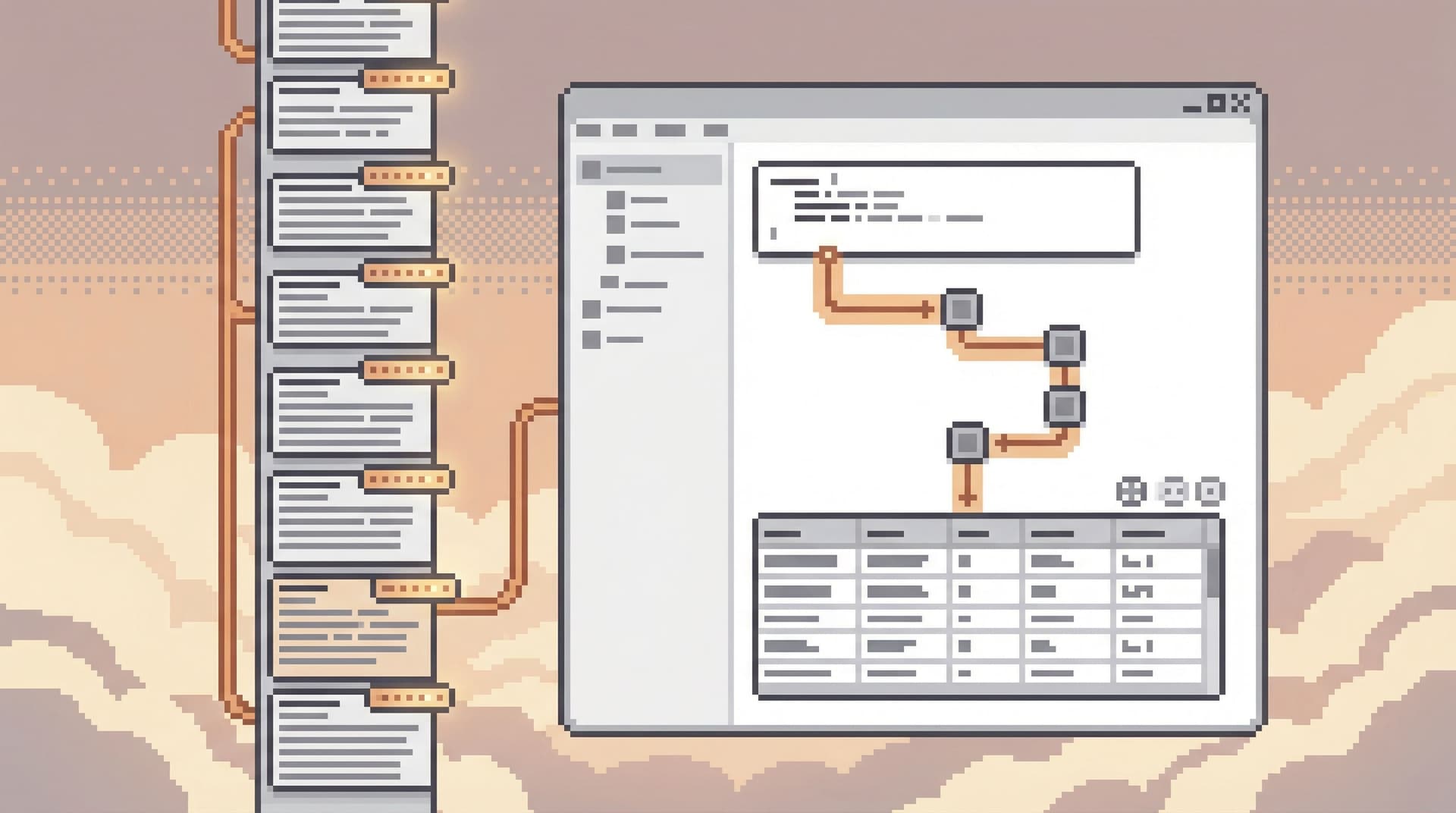
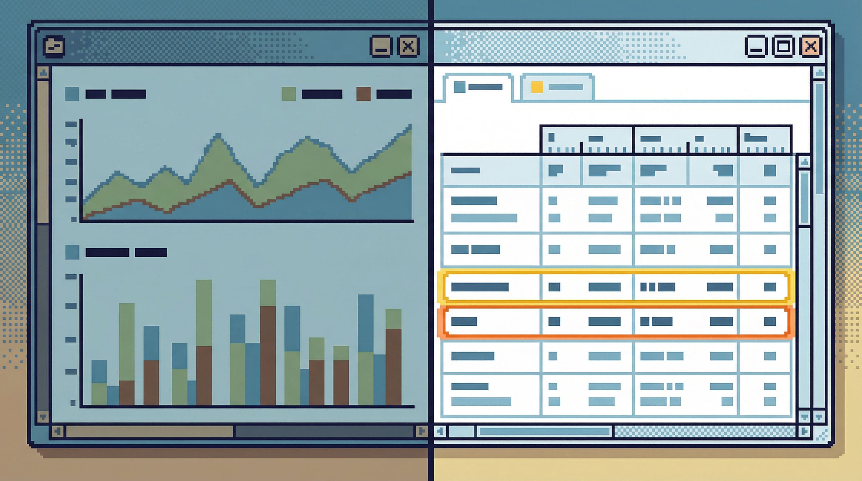
What a Database Browser Is (and Isn’t)
A lot of tools call themselves “database browsers.” Many are either:
- Mini‑IDEs: full SQL editors with schema trees and power‑user features, or
- Mini‑BI: chart‑first UIs with light table views bolted on.
A calm, opinionated browser like Simpl is different:
It is:
- Row‑first – optimized for reading concrete records, not building reports.
- Question‑shaped – navigation starts from real questions (“this user,” “this order”), not from table lists.
- Guardrailed – hard to run dangerous or noisy queries by accident.
- Shared – links, trails, and saved views instead of screenshots and copy‑pasted SQL.
It is not:
- A replacement for Looker, Mode, or Metabase for stakeholder reporting.
- A full admin console for schema changes, migrations, or performance tuning.
- A general‑purpose SQL IDE.
This middle layer is where most real production reads live. If that idea resonates, you may also like our earlier piece on naming this space: Post‑BI, Pre‑Admin: Defining the Missing Layer of Calm Database Tools.
How to Tell You Need a Browser, Not Another Dashboard
You rarely decide this in the abstract. You feel it in specific workflows.
Here are the clearest signals.
1. Your incidents resolve in rows, not charts
Look back at your last few incidents:
- Where did the decisive evidence live?
- What finally convinced the room that you understood root cause?
If the answer is consistently “a screenshot of a query result” or “that one tab in prod,” you already know the truth: incidents don’t resolve in dashboards; they resolve in rows.
We wrote about this pattern in more depth in From Metrics to Rows: A Focused Workflow for Jumping from Alerts into Production Data.
When that’s your reality, you want:
- A straight path from alert → relevant rows.
- A narrow surface that keeps you anchored to the failing path.
- A tool that makes it easy to share what you saw without a screen‑share.
That’s browser territory.
2. You keep building “debug dashboards” that nobody trusts
Debug dashboards start with good intentions:
- “Let’s make a panel for stuck jobs.”
- “Let’s chart failed payments by error code.”
Six months later:
- The definitions are stale.
- Edge cases aren’t captured.
- People still run ad‑hoc queries “just to be sure.”
The problem isn’t the charts. It’s the mismatch:
- Incidents are narrow and evolving.
- Dashboards are wide and static.
A browser like Simpl lets you:
- Jump from the alert to the exact jobs involved.
- Follow foreign keys and event trails calmly.
- Save the final, trusted view as a reusable path for next time.
No new dashboard required.
3. Support and success teams are blocked on “someone with SQL”
Common smells:
- Tickets tagged “needs engineer to check prod.”
- Slack threads where someone pastes a query and says “can you run this?”
- Long delays for simple questions like “was this refund processed?”
Here, dashboards don’t help much. You don’t want to expose the whole BI surface to non‑engineers, and even if you did, the questions are too specific.
A calmer pattern:
- Curate a small set of question‑shaped views in Simpl:
- “Customer timeline”
- “Order + payments + refunds”
- “Subscription state history”
- Put them behind opinionated read‑only roles.
- Let non‑engineers answer 80% of their own questions without a new chart or a new query.
This is exactly the kind of “read rails” we unpack in Designing Read Rails: How Opinionated Query Paths Reduce Risk and Cognitive Load.
4. Your on‑call runbooks quietly say “open the console”
If your runbooks for incidents, migrations, and backfills all contain some version of “log into prod and check X,” you’ve already admitted that dashboards aren’t enough.
A browser like Simpl gives you a better primitive:
- Named, shareable, pre‑filtered views for common checks.
- A consistent way to jump from IDs in logs to concrete rows.
- Guardrails that make 2 a.m. reads safer and calmer.
If this sounds familiar, you might appreciate The Calm Data On‑Call: A Minimal Workflow for Incident Reads at 2 a.m..
A Simple Heuristic: Trend vs Trace
When you’re deciding whether to build a dashboard or reach for a browser, ask one question:
Am I tracking a trend, or tracing a story?
Trends:
- Active users by day
- Error rate by endpoint
- Queue depth by worker
These belong in BI. They’re about patterns over time, shared across teams.
Stories:
- What happened to this user between 10:02 and 10:05?
- Why did this order move from
pending→paid→refunded? - Which rows did this migration actually touch?
These belong in a browser. They’re about specific entities, specific timelines, and concrete rows.
Once you see this split, a lot of work gets simpler:
- Stop trying to make dashboards tell stories they’re not built for.
- Stop using raw consoles for routine checks that could be calmer.
Use BI for trends. Use a browser like Simpl for stories.
What “Browser, Not BI” Looks Like in Practice
Let’s make this concrete with a few common workflows.
Workflow 1: Debugging a failing checkout
Scenario: alerts say checkout errors spiked for 5 minutes.
BI is good for:
- Seeing that error rates spiked.
- Scoping which endpoints or regions were affected.
A browser like Simpl is good for:
- Jumping from the alert or log line to the specific
order_idoruser_id. - Loading a pre‑built “checkout story” view:
- Orders
- Payments
- Refunds
- Relevant events/logs
- Walking through a handful of real examples:
- “This user’s payment authorized but never captured.”
- “This order has two payment attempts with different error codes.”
- Sharing that exact view with the incident channel as a link, not a screenshot.
You don’t need a new dashboard called “Checkout Incident View.” You need a calm path from alert → rows → shared understanding.
Workflow 2: Verifying a migration
Scenario: you just ran a migration that backfilled a new column.
BI is good for:
- High‑level counts: how many rows were updated, by day or by shard.
A browser is good for:
- Spot‑checking a small, representative set of rows.
- Comparing “before” and “after” states where you have known ground truth.
- Saving a “migration verification” view you can reuse for similar changes.
You could build a migration dashboard, but it will always be an approximation. The real confidence comes from calmly reading a few real rows and being able to repeat that check later.
Workflow 3: Answering support questions
Scenario: support asks, “Did this refund actually go through?”
BI is good for:
- Monitoring refund volume and error rates overall.
A browser is good for:
- Opening a “customer timeline” view in Simpl.
- Pasting the customer ID.
- Seeing all orders, payments, refunds, and disputes in one place.
- Sharing a link back to support that shows exactly what you saw.
No new dashboard. No ad‑hoc SQL. Just a calm, repeatable path from question → row.
Designing Your Own “Browser, Not BI” Layer
You don’t have to adopt Simpl to think this way, but it helps to design your tools and workflows around a few principles.
1. Start from one clear question
Every session against production should have a single center:
- “Why did this user get double‑charged?”
- “Which jobs failed in this run?”
- “Did this migration touch the right rows?”
If you can’t state the question, you’re about to wander.
2. Pre‑shape the paths, not just the permissions
Most teams stop at access control:
- Read‑only roles
- VPN + SSO
- Audit logs
That’s necessary, but not sufficient.
You also want attention control:
- Opinionated views for common questions.
- Guardrails around query shapes and limits.
- Navigation that keeps you close to the entity you started from.
Tools like Simpl are built around this idea: instead of a blank editor, you get calm, question‑shaped read rails.
3. Turn one‑off queries into shared memory
Every useful investigation leaves a trail:
- Which tables you touched
- Which filters mattered
- Which joins were actually relevant
In most tools, that trail dies as local query history.
A browser can:
- Save that trail as a named view.
- Let others reuse it without re‑writing SQL.
- Attach it to runbooks or incident retros.
Over time, you get a quiet knowledge base of how your team actually reads production, not just a pile of charts.
4. Prefer links over screenshots
A simple rule that nudges behavior:
- If you’re about to paste a screenshot of a query result, stop.
- Share a link to the view instead.
This gently pushes you toward tools that:
- Have stable URLs for specific reads.
- Make it safe for others to open those links.
- Preserve enough context (filters, joins, ordering) to be meaningful.
Browsers like Simpl are designed for exactly this kind of quiet handoff.
Summary
You don’t need fewer dashboards. You need fewer situations where dashboards are doing the wrong job.
Use BI when you’re:
- Tracking trends and aggregates.
- Communicating with stakeholders.
- Watching long‑running patterns.
Use a calm, opinionated database browser like Simpl when you’re:
- Debugging specific incidents.
- Answering concrete, entity‑level questions.
- Verifying migrations and backfills.
- Unblocking support and success on real rows.
Think in terms of trend vs trace, chart vs story, dashboard vs browser. Once you do, a lot of “we need a new dashboard” conversations quietly disappear.
Take the First Step
You don’t have to redesign everything at once.
A simple starting sequence:
- Pick one recurring workflow where people always end up in the console anyway: failed checkouts, stuck jobs, refunds.
- Write down the real question that workflow is trying to answer.
- Build a single, question‑shaped view for that workflow in Simpl or your browser of choice.
- Link it from the relevant runbook or alert.
- Ask the team to use that link first before writing new SQL or building a new dashboard.
If that one view makes incidents calmer, handoffs quieter, and questions easier to answer, you’ve proven the point:
You didn’t need another dashboard.
You needed a browser.
If you want a tool designed from the ground up for this middle layer — post‑BI, pre‑admin, focused on calm production reads — you can start exploring your own data with Simpl.