The Case for Fewer Charts: Building Database Tools That Show Just Enough


Dashboards are easy to create and hard to retire.
Most teams accumulate charts the way codebases accumulate TODOs. A new incident, a new product question, a new stakeholder request—another panel gets added. Nothing gets removed. Over time, the wall of charts stops clarifying reality and starts obscuring it.
For database tools, this matters even more. The database is where the story actually lives. If your interface to that story is a dense mosaic of visualizations, you’re not closer to the truth—you’re just looking at more pictures of it.
This post makes a simple argument:
Database tools should show just enough, not everything they can.
That means fewer charts, calmer layouts, and opinionated defaults that favor context over spectacle. Tools like Simpl are built around that stance: an opinionated database browser that treats charts as a last-mile aid, not the main event.
Why “More Charts” Quietly Stops Helping
Charts feel productive. They move. They update. They look like progress.
But past a small number, they start to work against you.
1. Visual Overload Masquerading as Insight
When every view is a chart, nothing stands out. You lose the ability to answer basic questions:
- What should I look at first?
- What changed since last week?
- Which of these is actually trustworthy?
You end up scanning instead of thinking. That same pattern shows up during incidents, where teams bounce between dashboards and raw SQL without a clear narrative. We wrote about this in more depth in Context, Not Dashboards: A Quieter Approach to Sharing Data in Engineering Teams.
2. The Hidden Cost of Maintenance
Every chart encodes decisions:
- Which tables and columns power it
- How data is filtered and aggregated
- How often it’s refreshed
- What “good” vs. “bad” looks like
As schemas evolve, product definitions shift, and pipelines change, each of those decisions can drift. A chart that was accurate three months ago can be quietly wrong now—and there’s rarely a clear owner for fixing it.
The result:
- Conflicting versions of “active users” across dashboards
- Charts that silently break when a column is renamed
- Panels that nobody trusts but nobody deletes
3. Charts Without Traceability
Most charts don’t tell you how to get back to the underlying data.
You see a line, a bar, a number. But you don’t see:
- The exact query that produced it
- The tables involved
- The assumptions baked into joins and filters
So when something looks off, you’re forced to reverse-engineer:
- Open the BI tool
- Guess which dataset it’s using
- Click around until you find the query
- Try to reconstruct the logic in your database client
That’s not analysis. That’s archaeology.
4. Misaligned With How Engineers Actually Debug
Real debugging questions rarely start as “show me a chart.” They sound more like:
- “Why did this user’s subscription cancel?”
- “Why did this job run twice?”
- “Why is this cohort missing events?”
Those are narrative questions. They cut across tables, time, and systems.
A static chart can be a useful checkpoint along the way, but it’s rarely the main tool. You need to:
- Inspect specific rows
- Follow foreign keys
- Compare before/after states
- Re-run slight variations of the same query
We dig into this style of work in Beyond the Schema Explorer: Designing Database Browsers for Real-World Debugging.
What “Just Enough” Looks Like in Practice
“Fewer charts” doesn’t mean no charts. It means charts that are:
- Sparse – only where they materially help understanding
- Traceable – always tied to a query you can inspect and rerun
- Local – scoped to the question at hand, not a generic dashboard
Here’s what that looks like in a calm database tool.
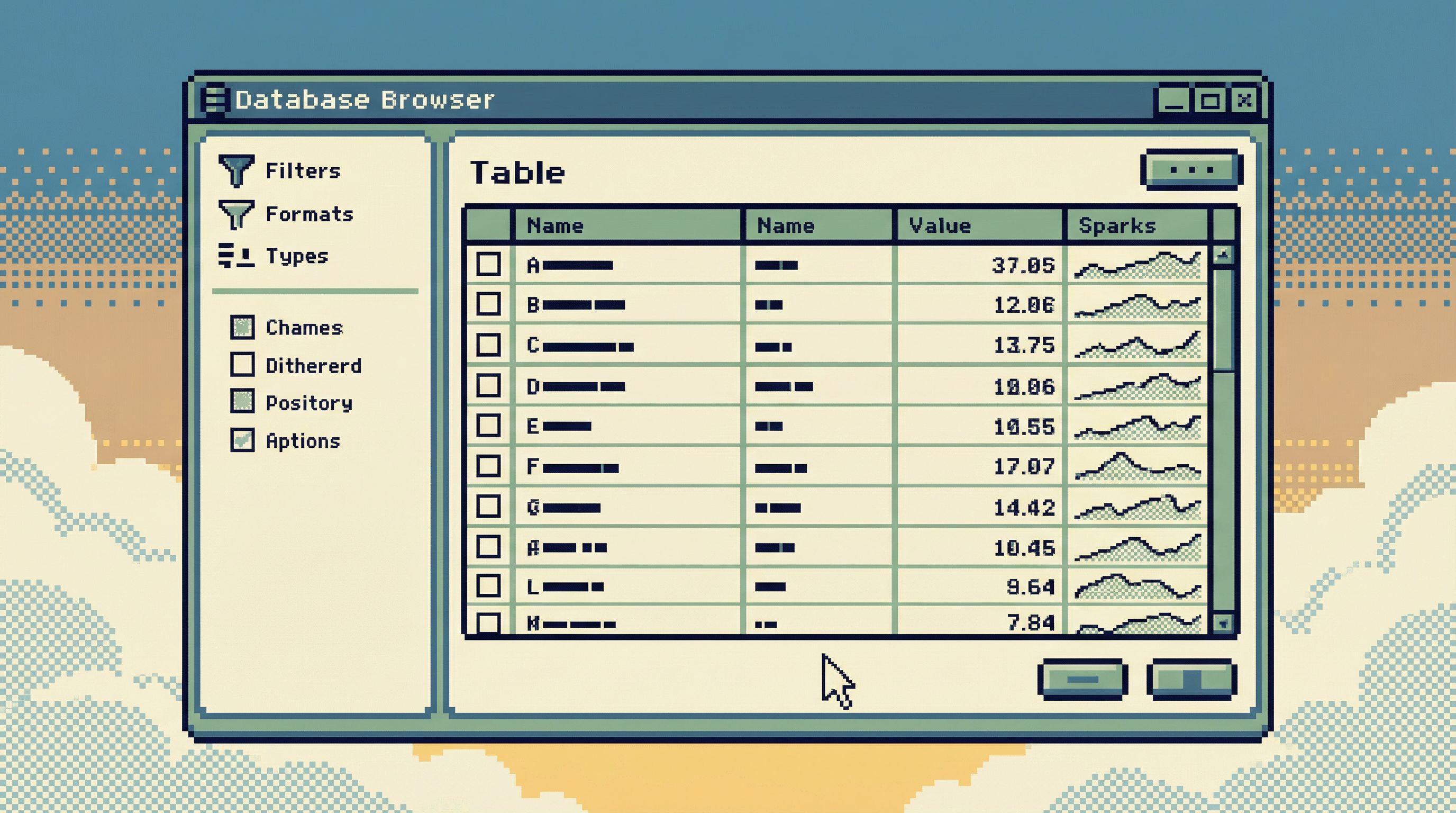
1. Tables First, Visuals as a Layer on Top
Start with the raw material:
- Rows
- Columns
- Relationships
Then add visuals where they help you see patterns you’d miss in a grid.
Good candidates for lightweight visuals:
- Small time-series sparkline beside a metric column to show trend
- Distribution preview (histogram) for a numeric column when you click into it
- Proportion bar for categorical breakdowns (e.g., status counts)
What you avoid:
- Full-page dashboards as the default landing view
- Chart galleries where you pick from 20 visualization types
- Unlabeled, free-floating charts with no visible query behind them
In Simpl, the core experience is still “read the data.” Visuals are there to support that reading, not replace it.
2. One Primary Question Per View
Every screen should answer one main question. Not five.
Examples:
- User-focused view – “What’s the story of this user over time?”
- Job-focused view – “What happened with this job run and its dependencies?”
- Metric-focused view – “Is this metric behaving as expected this week?”
For each view:
- Show the minimum data needed to answer that question
- Offer one or two optional visuals that clarify the answer
- Make it trivial to pivot to closely related questions (e.g., “show all jobs for this user”)
If you can’t state the main question of a view in one sentence, the view is probably doing too much.
3. Charts as Annotations, Not Destinations
Instead of building chart pages, treat charts like annotations on top of data:
- A mini time-series inline with a list of users, showing last-30-day activity
- A compact bar showing success vs. failure rate next to each job type
- A small trend line above a metric number in a detail pane
Key properties of these inline visuals:
- Always adjacent to the data they summarize
- Always backed by a visible, inspectable query
- Easy to hide or collapse when you don’t need them
This reduces the cognitive jump between “what I see in aggregate” and “what I see in rows.” You’re not switching tools or tabs to go from chart to data—you’re just scrolling a little.
4. Opinionated Defaults, Not Infinite Options
A calm tool says “no” more often than it says “yes.”
When it comes to charts, that means:
- A small set of defaults (e.g., line, bar, histogram) tuned for database work
- No custom theming, animations, or dense configuration panels
- Pre-wired chart templates for the most common questions
For example:
- When you inspect a timestamp column, the tool can offer: “Show events per day over the last 30 days.”
- When you inspect a status column, it can offer: “Show counts by status.”
You don’t need a full visualization grammar. You need a few sharp, trustworthy patterns.
This is the same philosophy we explored in Designing Opinionated Data Tools: When Saying ‘No’ Creates Better Developer Focus.
5. Built-In Guardrails Against Chart Sprawl
If you don’t actively prevent it, chart sprawl is inevitable. The tool should help you resist it.
Practical guardrails:
- Soft limits on saved views – nudge users to archive or consolidate when they exceed a threshold
- Usage-based pruning – surface which charts haven’t been viewed in 30/60/90 days
- Explicit ownership – every saved chart or view has an owner and a last-reviewed date
- Template-first creation – new charts start from curated templates, not blank canvases
These patterns don’t require heavy process. They just make it natural to keep the surface area small.
Designing a “Just Enough” Chart System
If you’re building or evolving a database tool—whether internal or productized—here’s a concrete approach to making charts calmer.
Step 1: Decide What Charts Are For
Write down, explicitly, what charts in your tool are supposed to do. For example:
“Charts in this tool exist to reveal trends and distributions that are hard to see in a table, for a specific question, with a direct path back to the underlying query.”
Then write down what they are not for:
- Not for stakeholder reporting
- Not for executive performance reviews
- Not for marketing slides
Those needs can live in a separate analytics or BI layer. Your database tool should optimize for exploration and debugging, not presentation.
Step 2: Limit the Places Charts Can Appear
Instead of “charts anywhere,” pick a small number of slots where they’re allowed:
- A detail pane for a single entity (user, job, order)
- A column inspector for a single column (distribution, null rate, trend)
- A metric-focused view for a small set of operational metrics
This makes it easier to:
- Keep layouts consistent
- Avoid panels competing for attention
- Reason about performance (no surprise 20-chart dashboards)
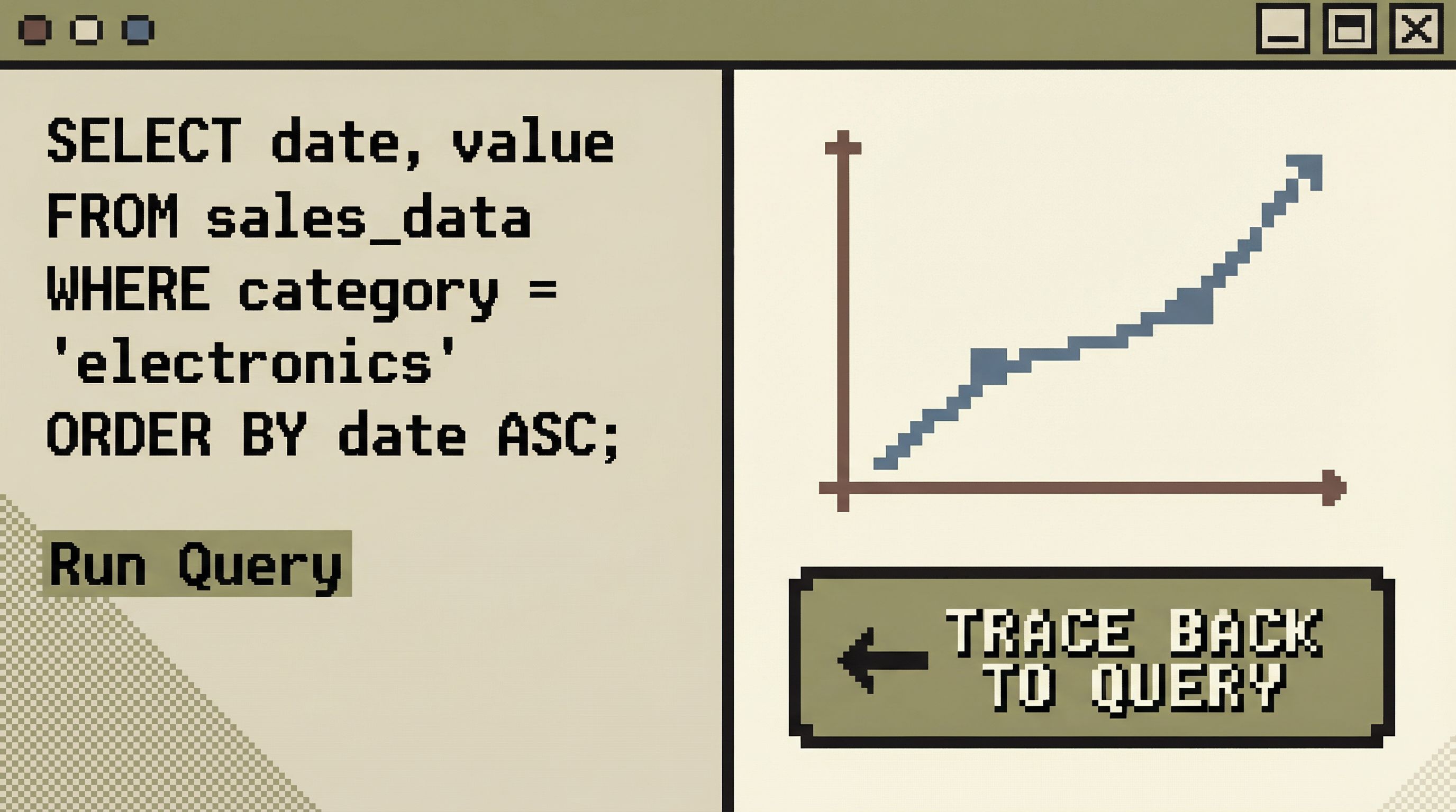
Step 3: Tie Every Chart to a First-Class Query
A chart without a query is a liability.
In a calm system:
- Each chart is backed by a named, versioned query
- Users can open that query directly from the chart
- Changes to the query are tracked and reviewable
This has several benefits:
- When a chart looks wrong, you can debug it like any other query
- You reduce the risk of “magic data” that nobody can reproduce
- You can reuse queries in other contexts (e.g., scripts, tests, other tools)
Tools like Simpl lean heavily on this idea: the query and the result are first-class; any visualization is just a different lens on the same, inspectable logic.
Step 4: Prefer Small, Local Metrics Over Global Dashboards
Global dashboards invite bloat. Local metrics encourage focus.
Examples of local metrics:
- On a user view: “Total orders,” “Lifetime value,” “Last seen at,” with a tiny sparkline of activity
- On a job type view: “Success rate (7d),” “Median duration,” “Error rate,” with a trend line
- On a table view: “Row count over time,” “Null rate for key columns”
These metrics:
- Live next to the entities they describe
- Are scoped to a specific context
- Are few in number, chosen deliberately
They give you the signal you need without sending you to a separate dashboard.
Step 5: Make Deletion and Archiving Normal
Charts should be easy to remove.
Patterns that help:
- One-click archive with a clear undo window
- Activity-based prompts: “This chart hasn’t been viewed in 60 days. Archive?”
- Review rituals: a monthly or quarterly sweep where teams prune unused views
Your goal isn’t to reach zero charts. It’s to keep the set live, small, and trusted.
Why This Leads to Calmer, Better Database Work
Fewer, better charts change how teams feel about their databases.
1. Less Cognitive Load, More Actual Thinking
When you’re not scanning past 30 panels, you have more attention for:
- Understanding models and relationships
- Reading rows carefully
- Asking better follow-up questions
This aligns with a broader pattern we’ve explored in Focus-First Database Workflows: Reducing Clicks, Tabs, and Cognitive Load: tools should reduce surface area so your brain can do the hard work.
2. Faster, Clearer Incident Response
During an outage, you don’t want a wall of charts. You want a short, reliable path:
- Start from a narrow incident view (e.g., affected users, failing jobs)
- Inspect the relevant rows directly
- Use one or two focused visuals to confirm whether the pattern is local or systemic
A handful of trustworthy, traceable charts will beat a sprawling “incident dashboard” every time.
3. Stronger Trust in the Numbers You Do Show
When every chart is:
- Backed by a visible query
- Scoped to a clear question
- Reviewed and pruned regularly
…people are more willing to act on what they see. They don’t have to silently wonder, “Is this definition still right?”
4. Easier Onboarding for New Engineers
New teammates don’t need a tour of 15 dashboards. They need:
- A few opinionated read paths into the database
- A small set of local metrics that define “healthy”
- Clear, narrative-first views for common questions
That’s much easier to teach—and much less intimidating—than a chart zoo.
Bringing “Just Enough” Into Your Own Stack
You don’t have to rebuild your tools from scratch to benefit from this approach. You can start small.
Here are three concrete moves:
-
Audit your existing dashboards.
- Identify charts nobody has opened in the last 60–90 days.
- Archive them. You can always bring them back.
-
Pick one workflow and redesign it around a single question.
- For example: “Investigate a failed job.”
- Build a view that shows: the job, its inputs, its outputs, a short history, and one or two small metrics.
- Remove everything else.
-
Enforce traceability for new charts.
- No new chart without a visible, inspectable query.
- No query without a clear name and owner.
If you’re building internal tools, bake these constraints into the UI. If you’re using off-the-shelf tools, you can still adopt the practices: fewer dashboards, stricter templates, more emphasis on queries and narratives.
And if you want a database browser that starts from this philosophy instead of fighting it, that’s exactly why we built Simpl.
Summary
- More charts don’t guarantee more insight. Past a small number, they increase noise, maintenance burden, and mistrust.
- Database work is narrative. Most real questions require reading rows, following relationships, and telling a story—not staring at a wall of graphs.
- “Just enough” charts are sparse, traceable, and local. They sit next to the data they summarize and are always backed by visible queries.
- Opinionated constraints beat infinite flexibility. Limiting where charts can appear, how many exist, and how they’re created leads to calmer, safer workflows.
- You can start small. Audit dashboards, redesign one key flow around a single question, and require traceability for any new chart.
Take the First Step
Pick one place where charts feel heavy right now.
Maybe it’s your incident dashboard. Maybe it’s a “metrics overview” page that nobody fully trusts. Maybe it’s an internal admin tool that started simple and grew sideways.
Today, do one of the following:
- Archive three charts you know nobody uses.
- Replace one dashboard with a focused view and a single, well-chosen visual.
- Add a direct “view query” link to any chart that matters for real decisions.
Small reductions compound. Each chart you remove creates space—for attention, for clarity, for better questions.
If you want a tool that leans into that philosophy from the start, take a look at Simpl. It’s built around the idea that calm, opinionated views of your database beat a wall of charts every time.