Calm by Default: UX Patterns That Make Dangerous Database Actions Feel Rare and Deliberate

Most database tools make it feel normal to do dangerous things.
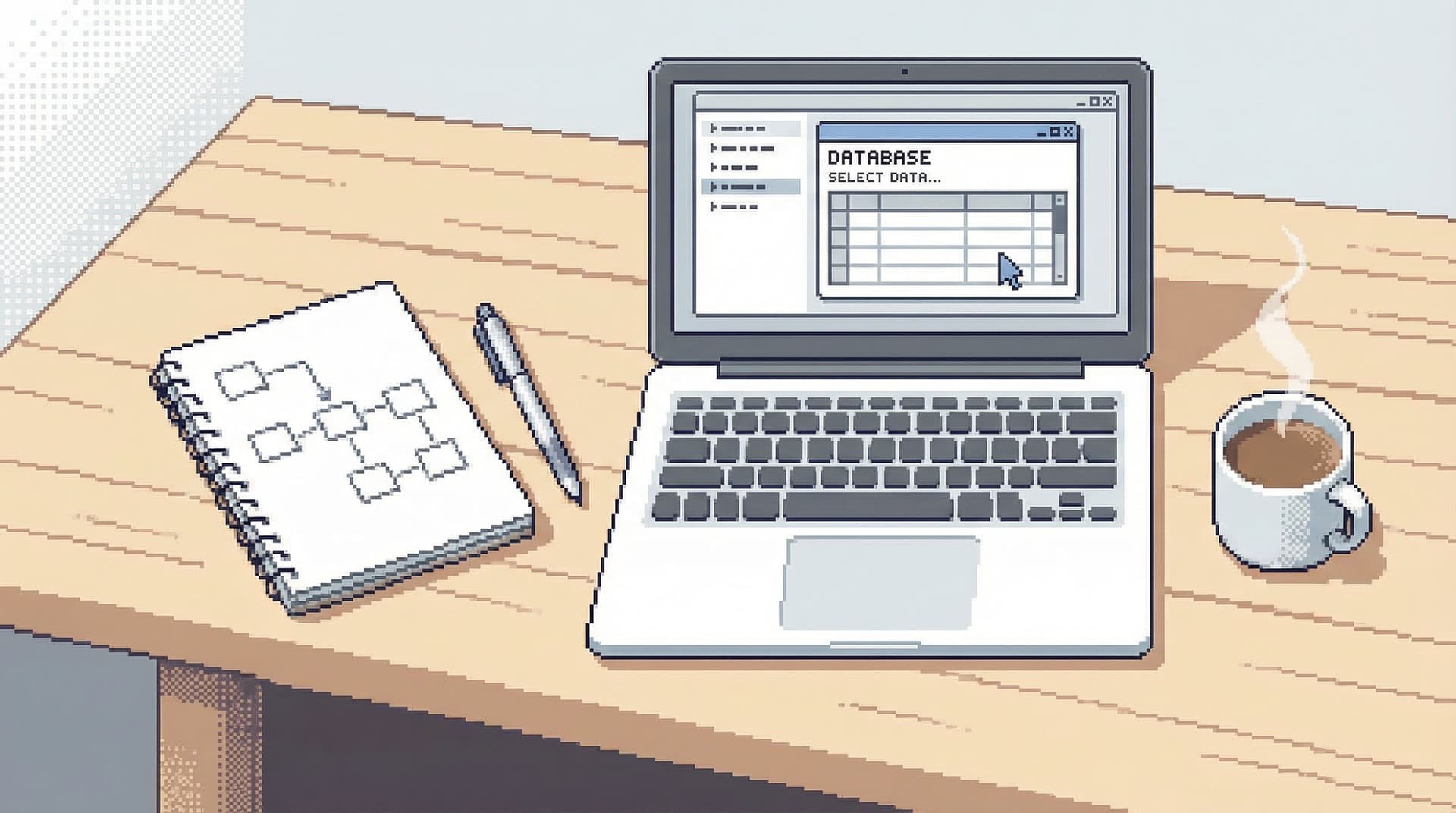
Open a client, connect to production, type into a blank SQL editor. Destructive queries sit one keyboard shortcut away from harmless reads. The UI doesn’t distinguish between:
- Inspecting a single user row
- Dropping a column
- Backfilling a table
- Truncating a queue
They’re all just queries.
When everything looks equally available, risk stops feeling special. Teams fall back on vibes and muscle memory instead of guardrails. “Be careful” becomes the only policy.
A calmer stance is possible: design the interface so that dangerous actions are rare, visually distinct, and deliberately slower. Make the safe paths feel like the default. Make the risky ones feel like a conscious crossing of a boundary.
Tools like Simpl are built around this idea. The goal isn’t to remove power. It’s to surround power with enough friction, context, and ceremony that you only use it when you truly mean to.
This post walks through concrete UX patterns that make dangerous database actions feel rare and deliberate—without turning every write into a ticket.
Why this matters more than you think
Risk in database tools rarely shows up as a single catastrophic button.
It shows up as:
- A missing
WHEREclause in a rushedUPDATE - A
DELETErun in production instead of staging - A migration applied to the wrong database
- A backfill query copy‑pasted from a doc and never re‑read
Industry surveys and incident postmortems consistently show human error as a major cause of outages and data incidents, often in the 60–80% range for operational failures. Many of those errors are not deep technical failures—they’re interaction design failures in the tools people use.
Designing for “calm by default” around dangerous actions gives you:
- Fewer silent disasters. The easy, default thing is less likely to corrupt data.
- Less ambient anxiety. Engineers can open production without feeling like they’re walking on glass.
- Faster, safer incident response. You can move quickly because the tool helps keep you inside the lines.
- Better onboarding. New engineers get guided into safe patterns instead of being handed a raw SQL canvas.
If you liked the idea of guardrails from posts like “Read-Only by Default: Building Safer Production Database Workflows Without Slowing Engineers Down”, this is the finer-grained version: not just who can write, but how writing feels.
Principle 1: Make reads feel normal, writes feel exceptional
The first move is simple:
Treat reading data as the default posture. Treat mutating data as a special mode.
In a calm database browser like Simpl, that means:
- Read-first surfaces. When you open a connection, you see data—tables, rows, trails of queries—not a blinking cursor inviting arbitrary SQL.
- Separate entry points for writes. You don’t “accidentally” end up editing. You explicitly choose to move into a write flow.
Concrete patterns
-
Read-only initial state
- First connection to a database opens in read-only.
- The UI clearly labels this: subtle badge like
Read-only · production. - Switching to write mode is explicit and reversible.
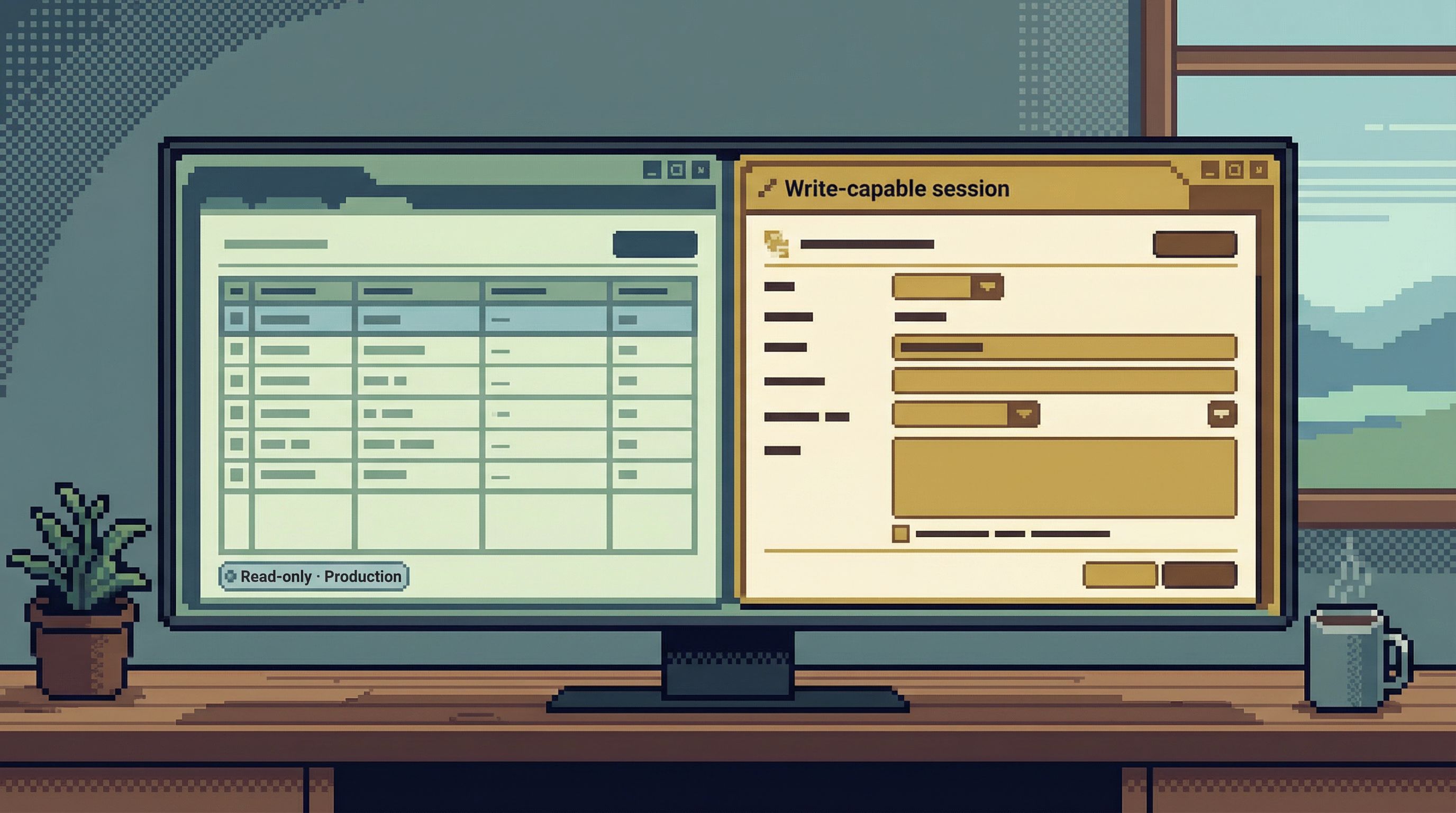
-
Distinct visual modes
- Read mode: calm, low-chroma colors, minimal affordances.
- Write mode: a clearly different accent color, subtle border, and a persistent label like
Write-capable session. - You should be able to tell which mode you’re in from a single glance, even in a screenshot.
-
Soft walls between modes
- No inline “edit in place” on result grids for production.
- No auto-promotion from read-only to write-capable because a query failed.
- You cross a boundary once, with intent, instead of drifting across it.
If you’ve explored the idea of a focused workspace in “The Single-Window Database Session: Structuring Deep Work Without Tabs, Panels, or Overlays”, this is the same philosophy pointed at safety: one clear state, not six overlapping ones.
Principle 2: Design “danger” as a journey, not a button
Most tools treat dangerous actions like this:
- One click on a red button.
- A generic confirmation dialog.
- Maybe a second “Are you sure?” if someone was nervous.
That’s not a journey. That’s a speed bump.
A better pattern: spread the decision across a short, guided sequence. Each step adds context and makes it slightly harder to proceed without thinking.
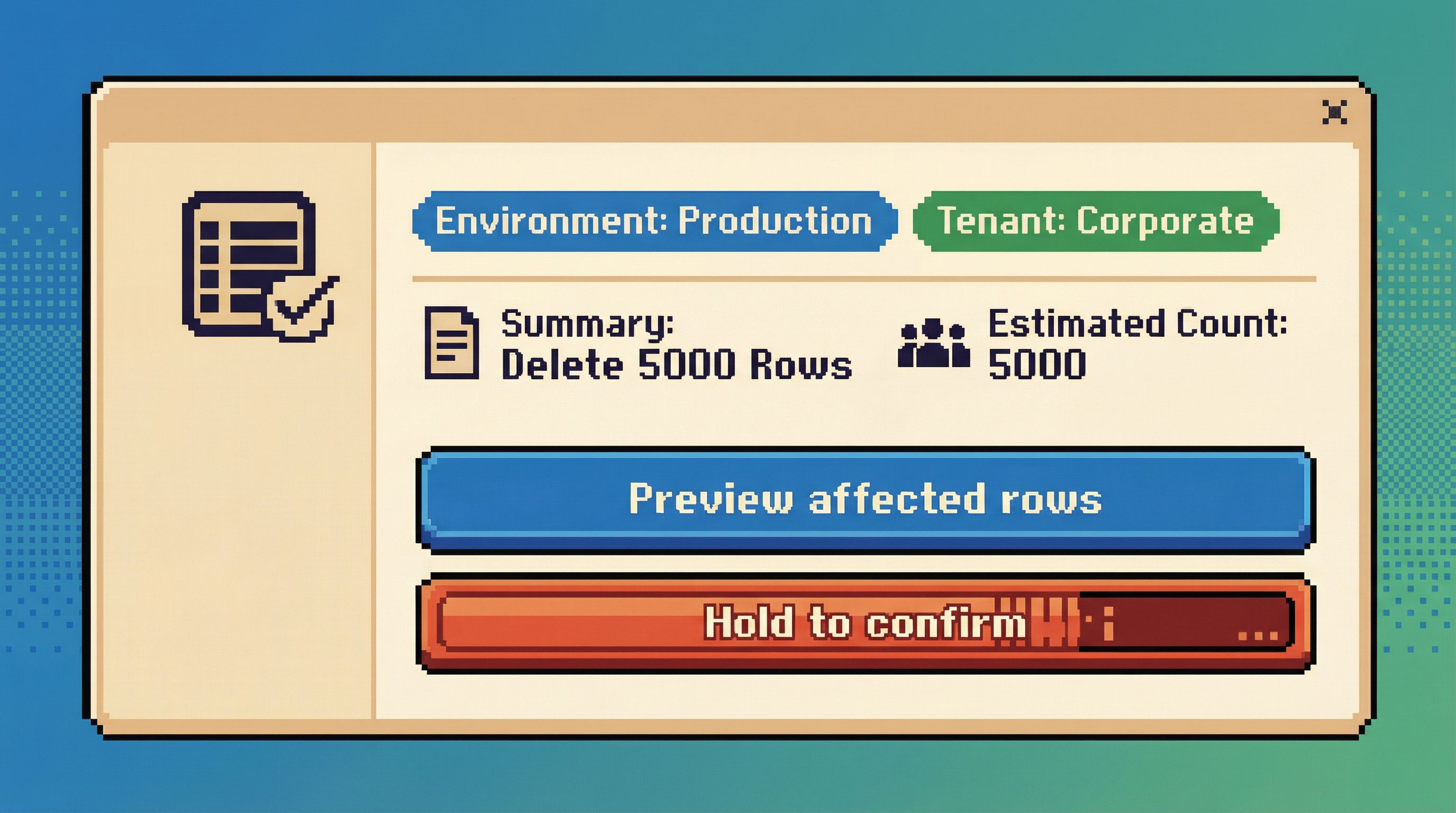
Example: running a destructive query in production
Imagine a user pastes this into a query editor pointed at production:
DELETE FROM orders WHERE created_at < '2021-01-01';
A calm, opinionated flow could look like:
-
Static analysis before execution
- Detect that this is a
DELETEagainst a large, non-temporary table. - Estimate affected rows based on statistics.
- Surface a non-modal inline warning:
This query may delete ~120,000 rows in production.
- Detect that this is a
-
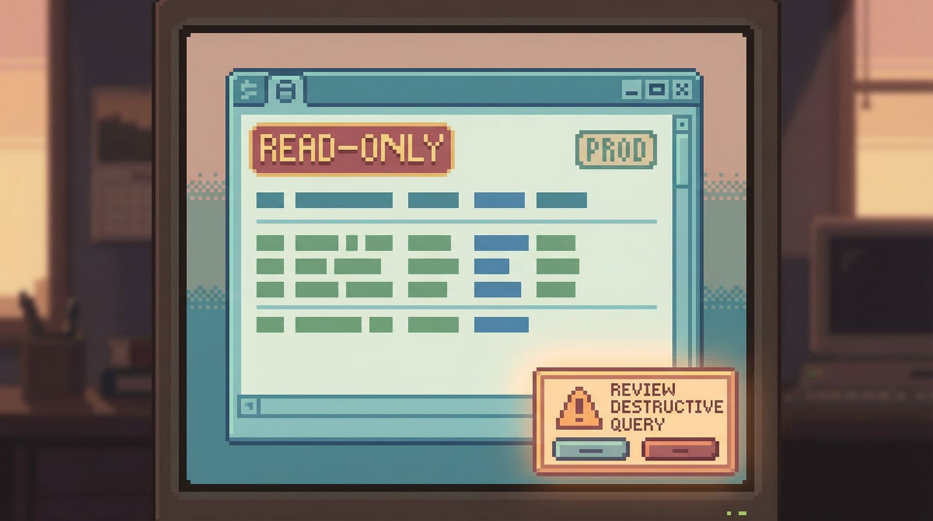
Require an explicit review step
- Pressing Run doesn’t execute immediately.
- Instead, the query appears in a small “Review destructive query” panel:
- Highlighted
DELETEkeyword. - Estimated row count.
- Target database and environment.
- A brief, human-readable summary:
Delete orders created before 2021-01-01 in production.
- Highlighted
-
Add a deliberate friction gesture
- Simple, but intentional: type a short confirmation phrase, or check a box that rephrases the action in plain language.
- No dark patterns like swapping button positions.
- Just enough friction to force a reread.
-
Show a dry-run option first
- Primary action:
Preview affected rows. - Secondary action:
Run delete now. - For many use cases, the preview is all they needed to realize the scope is wrong.
- Primary action:
-
Leave a trail by default
- When executed, the query automatically becomes part of a session trail with metadata: who ran it, when, where, and what the estimated vs. actual row counts were.
- This connects directly to ideas from “Read Trails, Not Logs: Turning Database Sessions into Shareable Narratives”: dangerous actions become readable stories, not just entries in an audit log.
The key is that danger isn’t a single click. It’s a short sequence of calm, informative steps that you can’t complete without noticing what you’re doing.
Principle 3: Make scope visible, specific, and hard to ignore
Most incidents are not caused by the wrong operation.
They’re caused by the right operation with the wrong scope:
- Right table, wrong environment.
- Right environment, wrong tenant.
- Right tenant, wrong time window.
A calm database browser should constantly answer three questions:
- Where am I? (environment, region, database)
- Who am I touching? (tenant, customer, shard)
- How big is this change? (row count, partitions, time range)
UX patterns for visible scope
-
Environment badges everywhere
- Clear, consistent labels:
Production,Staging,Local. - Color-coded, but not only by color—use text and shape as well.
- Visible in the window title, session header, and query trail.
- Clear, consistent labels:
-
Tenant and partition context
- When you filter by tenant or customer, that context “sticks” to the session.
- The UI reflects it:
Scoped to tenant: acme-corp. - Destructive actions outside that scope are visually louder and require extra confirmation.
-
Row-count awareness
- For
UPDATE/DELETE, show an estimated row count before execution. - If the estimate is above a threshold, the primary action becomes
Previewinstead ofRun.
- For
-
Time-range awareness
- When queries include time filters, surface them prominently:
Time window: last 7 days. - If there is no time filter on a large table, gently ask:
This query has no time filter on a large table. Is that intentional?.
- When queries include time filters, surface them prominently:
Scope is not a detail. It’s the main thing you want people to see before they do something dangerous.
Principle 4: Slow down the irreversible, keep the rest fast
You don’t want a tool that’s slow everywhere.
You want a tool that’s fast for exploration, slow for irreversibility.
That means being opinionated about what counts as “irreversible enough” to deserve ceremony:
- Dropping or altering tables and columns
- Mass updates/deletes
- Backfills that will be painful to undo
- Writes to personally identifiable or financial data
Patterns for intentional slowness
-
Tiered friction based on risk
- Low risk (small, scoped updates): inline confirmation.
- Medium risk (large updates in staging): review screen + preview.
- High risk (schema changes in production): review, preview, and possibly require a second person’s approval or a pre-defined migration plan.
-
Time-bound confirmations
- For the highest-risk actions, make the confirmation feel less like a reflex.
- Example: a 3–5 second “hold to confirm” button that fills up as you press, with the action summary visible the entire time.
-
No “one-click” schema destruction
- Dropping a table or column should never be a single click.
- The UI should:
- Show dependent objects (views, foreign keys, application references if known).
- Suggest safer alternatives first (e.g., soft-deprecate a column, hide from the main UI).
-
Prefer reversible patterns
- Encourage
soft_deleteflags over hard deletes in the UI affordances. - Make “archive to cold storage” easier than “drop immediately”.
- Encourage
This is where a tool like Simpl can be unapologetically opinionated: you’re not optimizing for raw speed; you’re optimizing for the right kind of speed.
Principle 5: Use language that matches the risk
Copy is part of UX. The words you choose can either normalize risk or highlight it.
Bad patterns:
- Generic confirmations:
Are you sure? - Vague actions:
Apply,Execute,Submit. - Overly casual tone for serious actions.
Better patterns:
-
Describe the action in plain language
Delete 12,431 orders in production.Drop column billing_address from users in staging.
-
State the environment explicitly
Run in productionvs.Run.Apply migration to stagingvs.Apply.
-
Acknowledge irreversibility when it matters
This action cannot be undone from this tool.Restoring this data will require a backup restore.
Language is cheap to change and high impact. Calm tools use it precisely.
Principle 6: Make the trail part of the design, not an afterthought
Dangerous actions feel less scary when you know you’ll be able to answer, later:
- Who did this?
- Why did they think it was safe?
- What exactly ran?
Most tools answer that with an audit log buried in a settings page.
Calm tools answer it with visible trails woven into the main experience.
Patterns that help:
-
Session-based narratives
- Every query—especially writes—lives in a session trail.
- You can scroll back through the story: filters added, previews run, final action executed.
- You can share that trail with a teammate, who sees exactly what you saw.
-
Inline annotations
- For destructive queries, allow short notes:
Backfilling missing invoices after Stripe outage. - Show these notes prominently when someone revisits the trail.
- For destructive queries, allow short notes:
-
Shareable context for support and incidents
- Instead of saying “I ran a delete and now things are weird,” someone can paste a link to the exact session.
- This connects directly to practices in “Async Debugging: How to Share Database Context Without Spinning Up a Meeting”.
When trails are first-class, dangerous actions stop being mysterious. They become understandable episodes in a longer story.
Putting it together: a calmer pattern for dangerous work
If you’re designing or choosing a database tool, you can use these questions as a quick checklist:
- Does the tool open in read-only or write-capable mode?
- Can you clearly see which environment you’re touching at all times?
- Are destructive queries treated as a guided flow, or just another “Run” click?
- Is the estimated scope of a change visible before you commit to it?
- Do schema changes require more ceremony than simple reads and small updates?
- Is there a readable trail of what happened, not just an audit log?
- Does the language in the UI match the seriousness of the action?
You don’t need to rebuild your stack to start moving in this direction.
You can:
- Add a read-only default to your existing SQL client configuration.
- Introduce lightweight review steps for dangerous queries (even in a CLI, via scripts or wrappers).
- Standardize environment labels and colors across tools.
- Encourage teams to capture and share trails of risky operations, not just screenshots.
Over time, you can move to tools that bake these patterns in—opinionated browsers like Simpl that start from calm defaults instead of raw power.
Summary
Dangerous database actions don’t have to feel routine.
By designing for calm by default, you:
- Make reads feel normal and writes feel exceptional.
- Turn destructive actions into short, guided journeys instead of single clicks.
- Keep scope visible—environment, tenant, row counts, and time windows.
- Slow down the irreversible while keeping exploration fast.
- Use precise language that reflects real risk.
- Turn actions into trails that your team can read, share, and learn from.
These patterns don’t just prevent outages. They change how it feels to work with data: less ambient anxiety, more confidence, and a clearer mental model of what’s actually happening when you press Run.
Take the first step
You don’t need a full redesign to start.
Pick one of these moves and ship it this week:
- Make your primary production client open in read-only by default.
- Add a simple “review destructive query” step for
DELETE/UPDATEwithoutLIMIT. - Standardize environment labels and colors across your tools.
- Start capturing shareable trails for any risky operation.
Then notice what changes: fewer nervous Slack messages, fewer “oops” moments, and a quieter mental state when you open production.
If you want a tool that leans into these patterns out of the box, explore Simpl—an opinionated database browser built to make dangerous actions feel rare, deliberate, and calm by default.